Alright – so today we’ve got the honor of introducing you to Fátima Lázaro. We think you’ll enjoy our conversation, we’ve shared it below.
Fátima, thanks for taking the time to share your stories with us today Can you talk to us about a project that’s meant a lot to you?
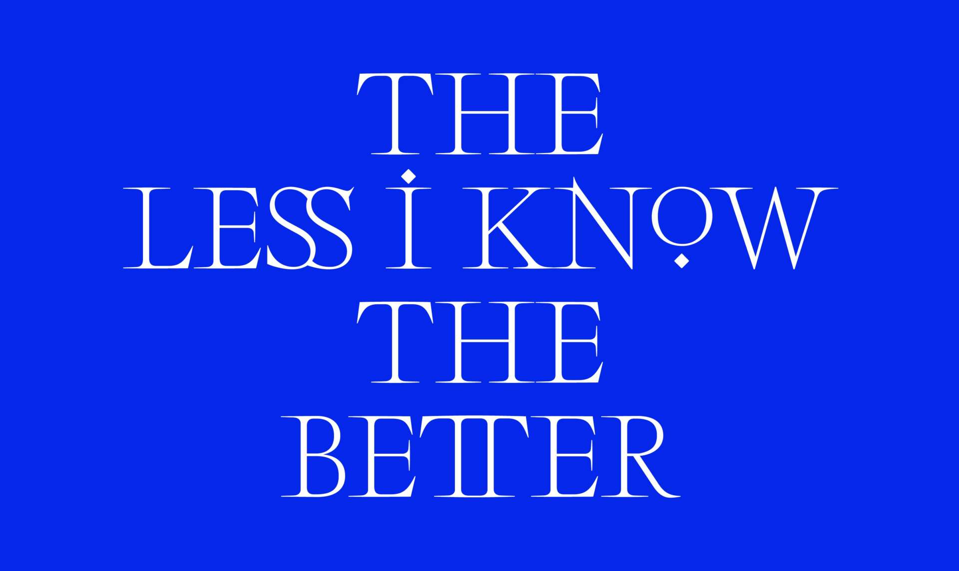
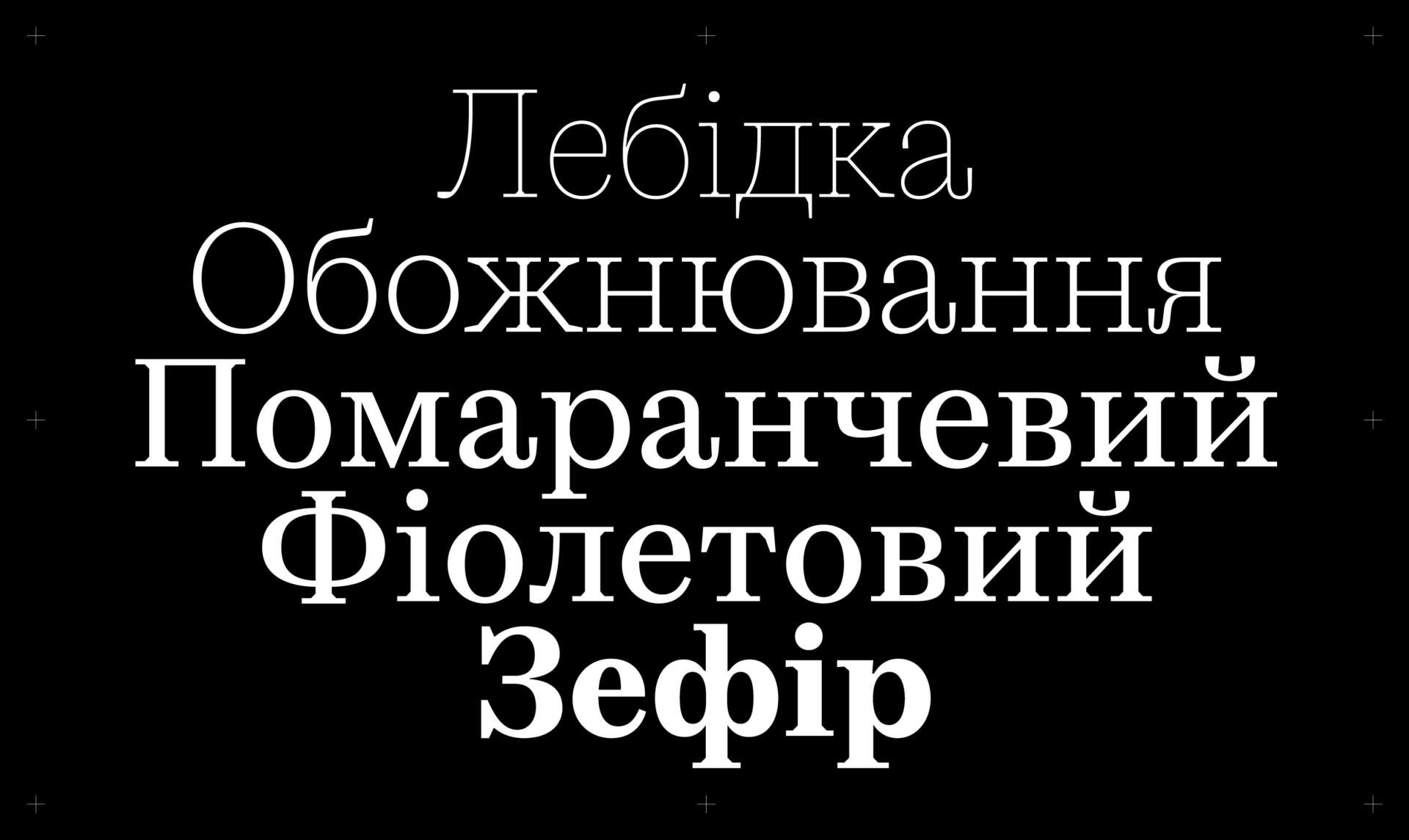
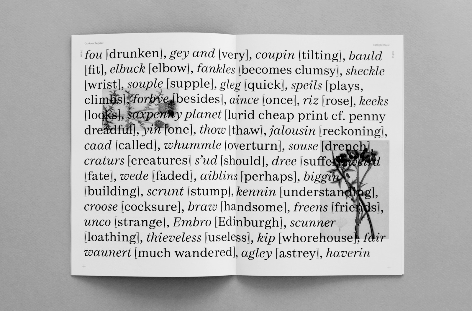
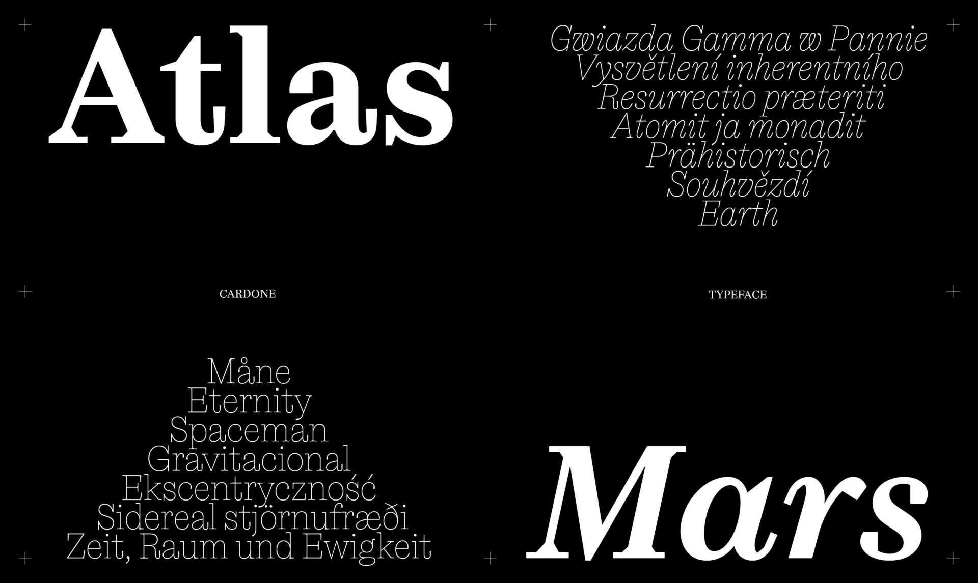
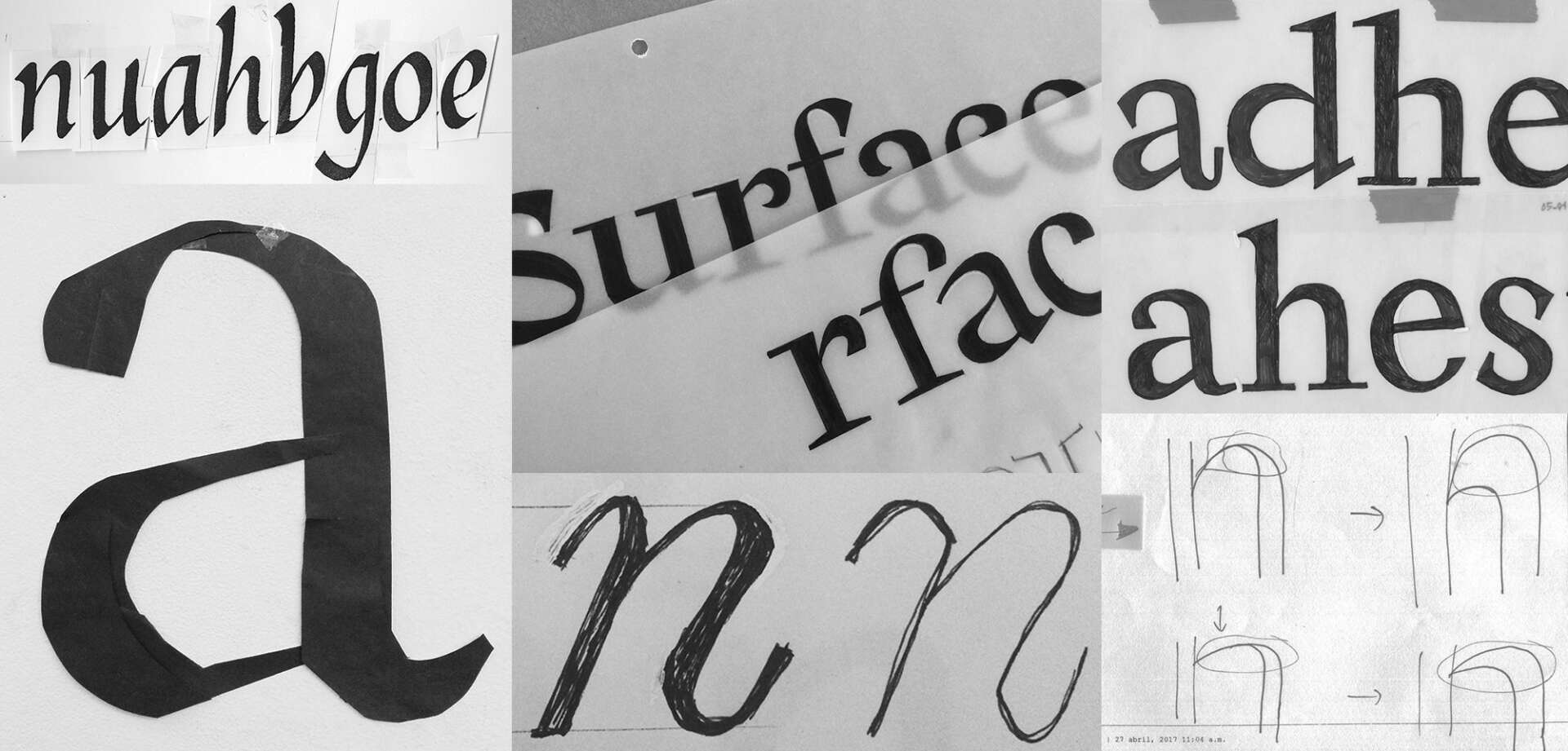
I would like to celebrate and remember once again, that this project is and continue to be a project that means great things to me. Cardone typeface started as my main project at Typographie & Langage (EsadType) postgraduate course in Amiens, back in 2016. It was my very first experience creating a typeface, and especially an extended family, with a several weights, styles and optical sizes. This project embodies everything that carries that first experience, from the basic knowledge of the letter, the historical research, until complete an extended latin character set to be able to release it through a foundry. The typeface has been conceived to be both functional and legible, mainly for use with running text, and optimized for editorial design purposes. During the process I always had in mind to see it in use across catalogues, monographs, independent magazines, or small self-initiated projects and publications, for example, in both digital and print. I think that one of the most exciting things as a typeface designer is discover all the interesting applications that designers can create with your work, it’s very surprising and rewarding.
It took me around 5 years to develop the full family. That time was not fully dedicated to Cardone, I had to work on it after my weekly working hours and when I had the chance during my holidays. Nevertheless, to accomplish a personal project in this particular way, helped me to enrich the process and to make important decisions, in first instance by the guidance of my beloved professors, then the job experience and the exchanged ideas with my fellow colleagues. For all that, Cardone turned into a very valuable and significant first experience. Finally was released in 2021 and is available through a French Foundry, 205TF.
Great, appreciate you sharing that with us. Before we ask you to share more of your insights, can you take a moment to introduce yourself and how you got to where you are today to our readers.
I am Mexican typeface designer living between Paris y Mexico City. Currently working as a freelance doing alphabets, creating typefaces, including bespoke designs and type development, lettering among other things for commissioned work, in addition to developing my own typeface design projects. However, it hasn’t always been this way, I went through a first step called Graphic Design. During my studies in my home country I had my first real approach to typography through its applications in editorial design. After getting my degree, I quickly embarked on a professional career, it was while working as a graphic designer for almost 10 years, particularly in the field of publishing and visual identity, that my interest for typography and type design was confirmed. I became aware of the fundamental role of typography in the creative process, and how it influenced the results, in addition to visualizing the possibility of developing my own letters.
During a trip to Paris to learn French back in 2015, I discovered the Typographie & Langage (EsadType) postgraduate course in Amiens, France. Where I studied type design alongside talented teachers and professionals (I feel very lucky to have had this opportunity) and a new world opened up to me, in which I am very delighted to navigate. Since then, I have divided my time between collaborating with different companies, foundries and type designers and my own typographic practice, heavily influenced by historical references, graphic and industrial design, but also art, architecture, pop culture and music.
My practice is driven by genuine curiosity and a great commitment to the objectives of my collaborators and the context of their projects. My goal is to create contemporary, versatile and functional tools ready for a wide variety of professionals out there to create great images and communicate powerful messages.
Type Design is profession that takes a long time to master, and that requires several stages for the creation of a typeface (design, development, production, kerning, mastering, etc.). You can take a considerable amount of time to develop and release your own creations, it all depends on your process and aspirations, is not the same case with custom or collaborative projects, where there is a fixed delivery time, this has allowed me to understand my creative process as a continuous process. In addition to celebrate the importance of collaborating with other designers, and colleagues as a team, by associating the particular skills of other type of designers and other disciplines.
For me, typography is a discipline, like art or fashion design, that guided by the use of new tools and technologies, they are part of the visual spectrum that evolves over time and defines in some ways the soul of an era. Typography is animated by various considerations (beauty, singularity, utility, legibility, contemporaneity, etc.) and this allows us to say that, the creation and design of a new typeface enables us to respond to a particular set of needs in the present moment, and that contributes to creating current visual landscapes.
We often hear about learning lessons – but just as important is unlearning lessons. Have you ever had to unlearn a lesson?
During my studies, and through my professional experience as a Graphic Designer, from editorial design to visual identity, as Junior Designer to Art Director, it was inevitable (or almost) to focus on the final result or the final product as the most important thing, the “design” is presented as a single carrier: the Artist, the Agency, or the Publishing House, for example. The fact that Design is a collaborative process has become invisible (particularly, historically and pedagogically). Today, I like to think that my way of conceiving Design has been transformed, precisely because most of my work currently (80%) consists of assisting and collaborating with other typeface Designers, foundries, agencies, or Design studios, as well as independent professionals, while the rest of my time is spent on my own projects. So, it is precisely teamwork, the focus on the creative process and the relationship I have with my collaborators, that plays a key role in the projects in which I am involved and from which I invariably continue to learn.
Have any books or other resources had a big impact on you?
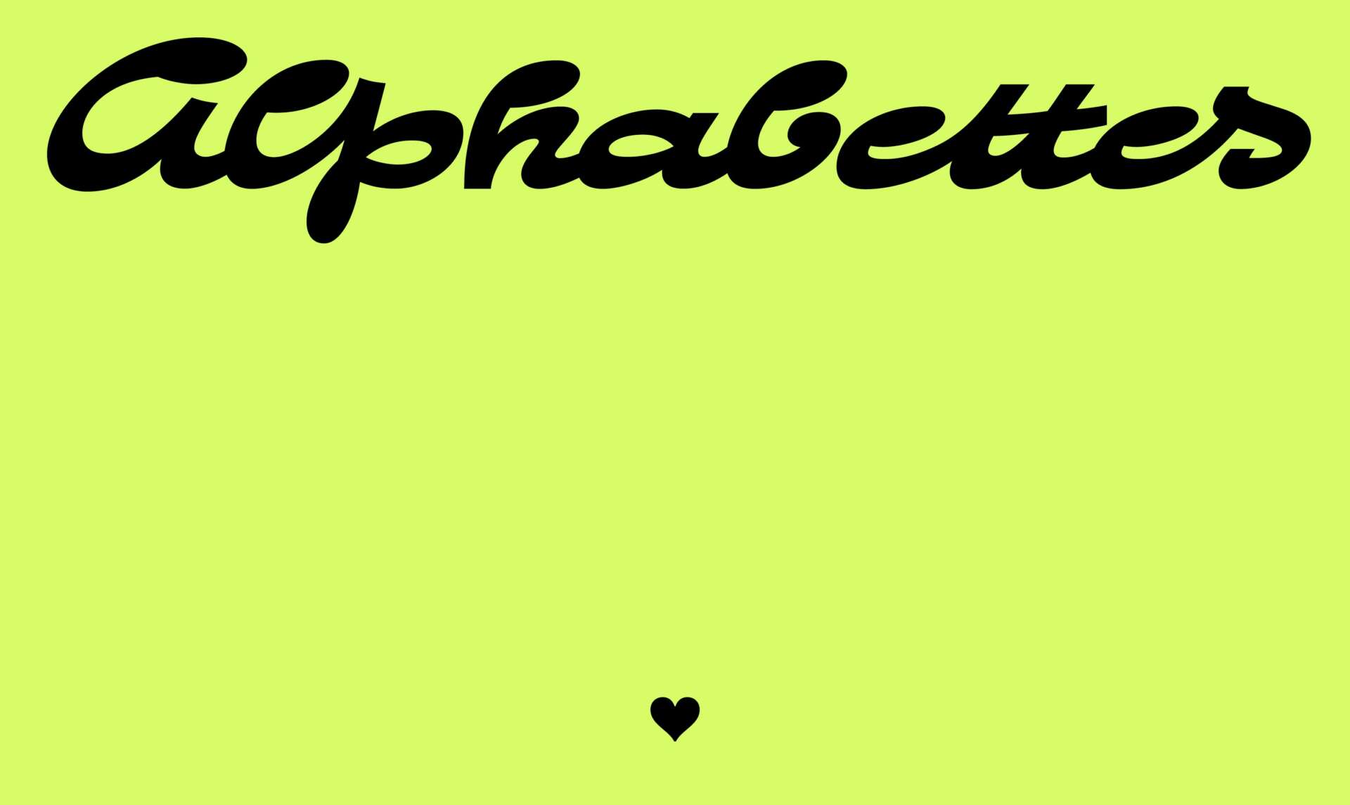
I would like to add to the previous idea, that there is a magnificent project that has enlightened an almost unexplored field in our discipline (Type Design). Women in Type (women-in-type.com) is a research project highlighting the work of women as key contributors to the design process of many renowned typefaces of the 20th century. This research is led by Prof. Fiona Ross with principal researcher Dr. Alice Savoie and post-doctoral assistant Dr. Helena Lekka. This website guides us through several topics (Women & Work, Approach to History, Feminisms, Women’s History, and many others), a photographic archive, in addition to a large bibliographic list. This type of content have guided me and brought me closer to other ways of seeing, creating, and inspiring me above all. Last but not least, I would like to invite you all to visit the site Alphabettes.org, is a showcase for work, commentary, and research on lettering, typography, and type design. This network is a safe space to support and promote the work of all women and nonbinary people in our fields, something increasingly urgent in our days.
Contact Info:
- Website: www.fatimalazaro.com
- Instagram: @fatimalazaro___
- Linkedin: linkedin.com/in/fátima-lázaro-6b648794
Image Credits
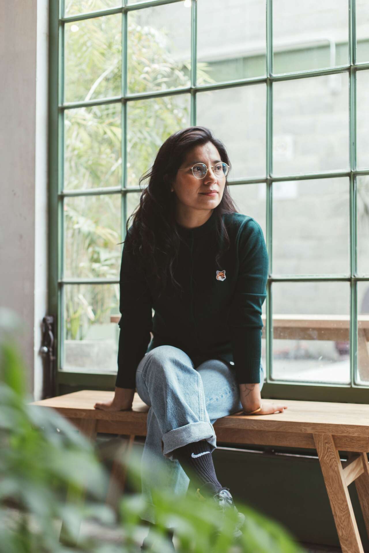
1. Portrait by Alberto García