We’re excited to introduce you to the always interesting and insightful Zengqi Guo. We hope you’ll enjoy our conversation with Zengqi below.
Zengqi, thanks for joining us, excited to have you contributing your stories and insights. We’d love to hear about a project that you’ve worked on that’s meant a lot to you.
The most meaningful project for me is MiXeR, a typeface that I created when I was doing my thesis research in grad school at RISD in 2021. This project not only helps me find what my interests are, but also establish my working method in graphic design.
In “ ‘We’ Are In This Together, But We Are Not One and the Same,” philosopher and feminist theorist Rosi Braidotti posted six insights to attempt to account for our posthuman predicament in the context of the COVID-19 pandemic. I was intrigued
by her insights about the need for criticism of humanism and the redefinition of the scope of the human subject. Braidotti reminds us that not all humans are equal, and the human has never been a neutral category. It is a normative category for accessing rights and privileges. The subjects mentioned in the humanistic thought that “man is the measure of all things”
used to define the quality of humanity are also those specific subjects with a sense of superiority and privilege(1). In the ever increasing wave of criticism of humanism and anthropocentrism, the marginalized “human” is moving towards the center. I realize that I am very excited about the topic of redefining what is human and what is humanity. Because it requires thinking about who is included in this category, I am thinking about what we are ceasing to become and what we are going to become(2). The uncertainty of walking on the edge, the urge to break or invade the border, and the curiosity of the unexplored field are the source of inspiration and creativity for me.
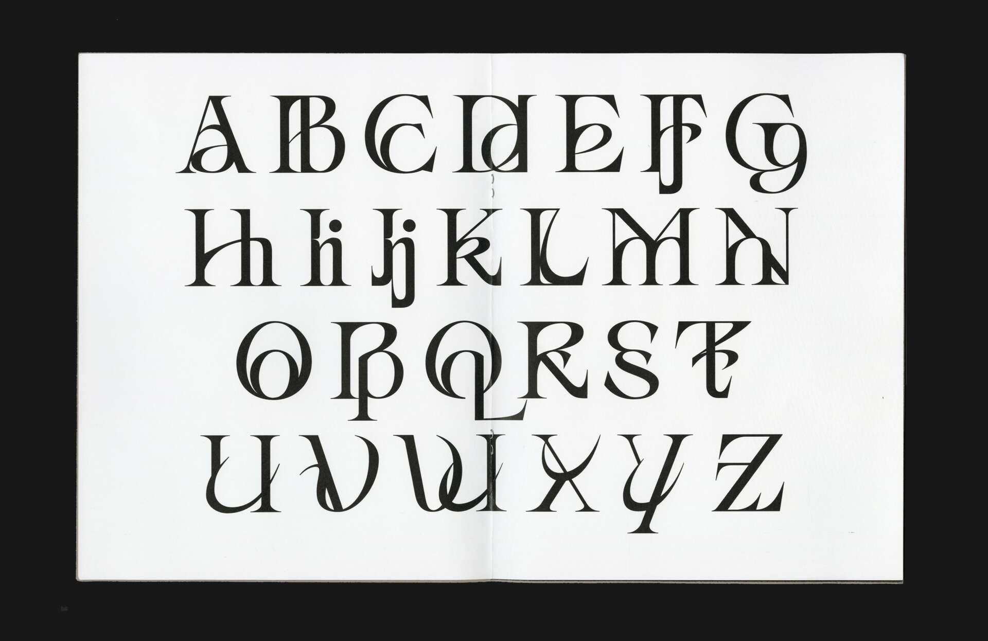
The hidden hierarchy in humanity that Braidotti talks about made me realize that hierarchy is everywhere. In addition, I also noticed that the word “hierarchy” has always been a good friend of graphic design. It is even hidden in the written
representation: capital letters are always used for exclusive nouns and to emphasize the beginning of each sentence. It always appears with a louder voice, so eye-catching, but it is indeed a very small part of the text. On the other hand, lowercase letters carry the most information, but they are considered to be the second letter case with a smaller voice.
I think in the posthuman era, uniting human and non-humans who are or were marginalized or excluded from the category of ‘human’ can start to solve humanity’s ‘hierarchy problem.’ We must make a cooperative collective—with inherently
complex inner-connections— between posthuman and human subjects. The first thing to do is to solve the problem rooted in the written language of recording history and information, which to challenge the design of the letter case that represents a hierarchy.
Graphic design is about finding the most suitable and efficient ways of visual communication. Typeface selection is crucial when we work with text. Because each typeface has its own characteristics and sounds, it also carries the spirit of the times in which it lives. Choosing a suitable typeface can enhance effective communication with others. I am thinking about what kind of typeface can be used within texts to perfectly embody the posthuman spirit.
In this experimental typeface, I blended the upper and lower case of each letter in proportion to try to establish a visual harmony in their complex relationship. Differences are allowed to exist here because it is not about “either/or” but rather “and/and.” Both uppercase and lowercase letters coexist in the whole, blurring formal boundaries and building interconnections.
1. Braidotti, Rosi. “We” Are In This Together, But We Are Not One and the Same. Bioethical Inquiry 17, 465–469 (2020).
2. Braidotti, Rosi. “Posthuman: All Too Human.” Mar. 2017, New Haven, Whitney Humanities Center.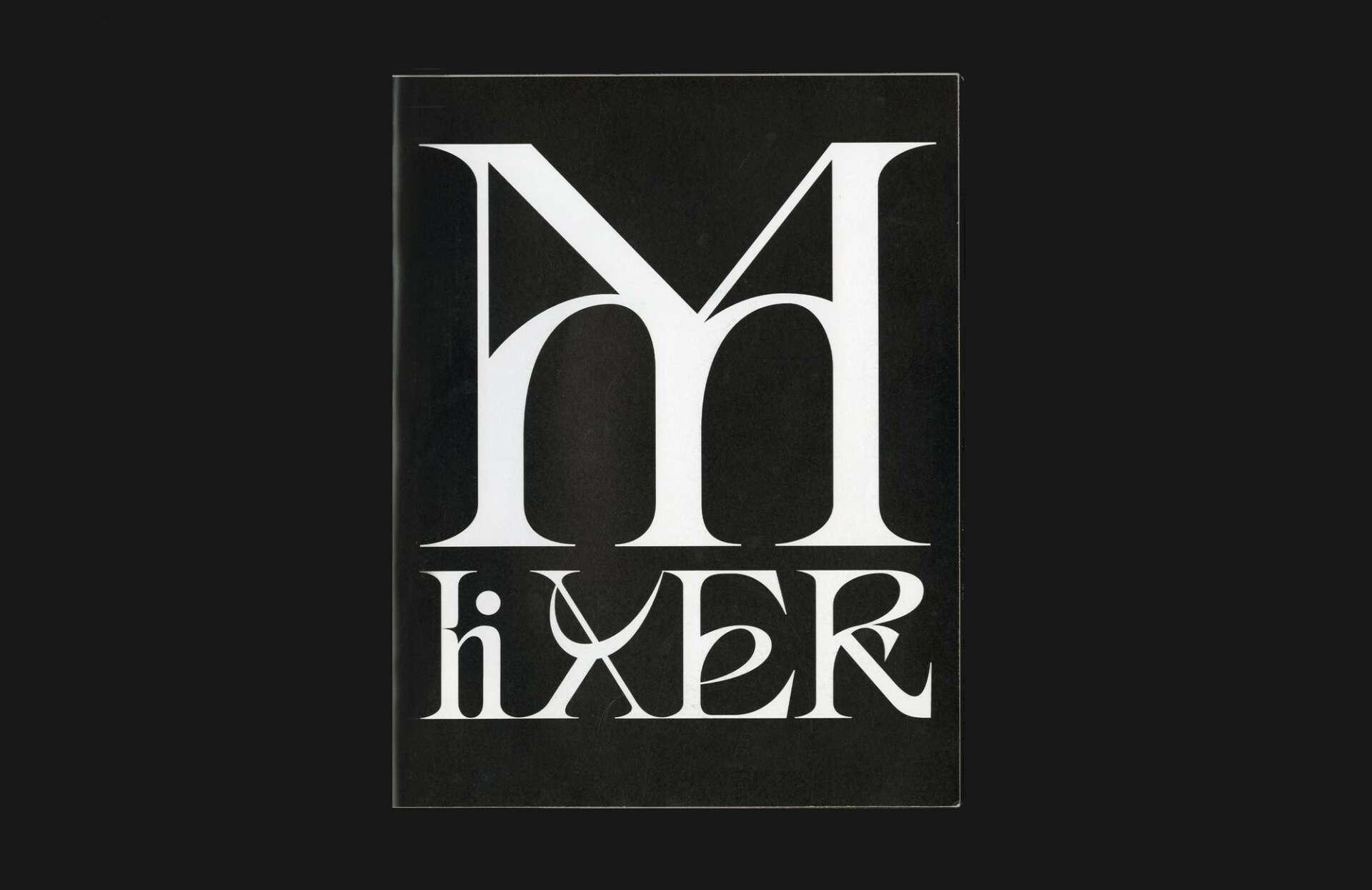
Zengqi, before we move on to more of these sorts of questions, can you take some time to bring our readers up to speed on you and what you do?
I was majored in landscape architectural for undergrad study back in China. At the same time, I am always interested in visual art and have the curiosity to take an adventure and learn more about this world, so I decided to step out my comfort zone, study aboard, and pursue graphic design in grad school at RISD. This is the best experience I have ever had. Not only because I was making cool work and knowing cool people there, but also I know myself more while figuring out “why am I doing this”. When knowing the reasons behind my design decisions, I can connect my identity closely with my creation.
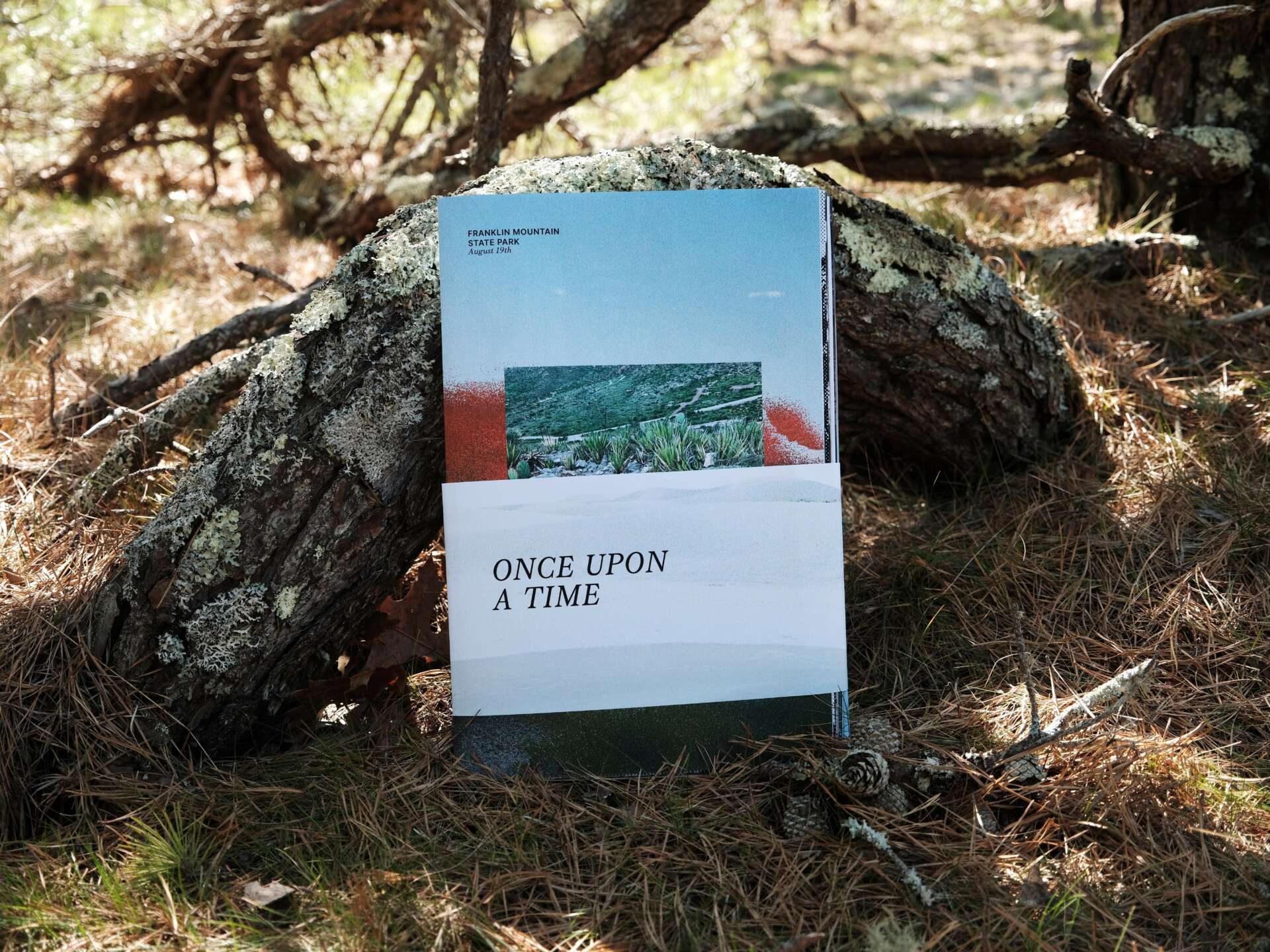
One of the example is when working on my grad thesis book, Alien Encyclopedia, I found where my interests in the word alien comes from and then how I make use of the interest and turn it into my working method.
English is not my first language; English is not my first language; it is a second (and I would say alien) tongue to me. In these two and half years, while studying abroad in the United States, advanced terms used in class are always confusing. My professors and classmates have been supportive translators, using alternative words to convey meaning— something simpler and more common. For example, in a typography class we were introduced to a type specimen book, How to Speak Rooster by Cyrus Highsmith. This was probably the first time I heard the word ‘rooster’ because I cannot remember having studied this word for the standard TOEFL test, though I sensed it had something to do with a chicken, according to the illustrations. I wondered and asked my peers what’s the difference between a chicken and a rooster? Katie Burwick told me that a rooster is a dude. Suddenly, everything was clear to me.
I frequently use the online dictionary to define terms. It’s helpful in learning a new language and for sharing information. I look for supportive words. Even a simple word often has many associated meanings. With my strong interest in the word “alien” from sci-fi movies, I dug deeply into its etymology. In my search for a more nuanced understanding of the word, I discovered that it depends on the way in which a word is used. Alien as an adjective, for example, derives from the 13th-century Old French alien meaning “strange, foreign.” As a noun, it comes from the Latin alienus “of or belonging to another, not one’s own, foreign, strange.” From 1953 onwards, it appeared in science fiction to mean “being from another planet.
With this foundational understanding, I expanded my map of meaning and, in doing so, harnessed its power through a systematic sorting of this concept. By always looking for alternative ways to support and add new meaning, my exploration grew in depth and breadth. I’m now even more committed to building new relationships out of the nexus of this word and its intertwined meanings, both exclusive and inclusive to identity and communication. By inserting the suggestive power of this word in my visual language, I propose a new aesthetic and new language status.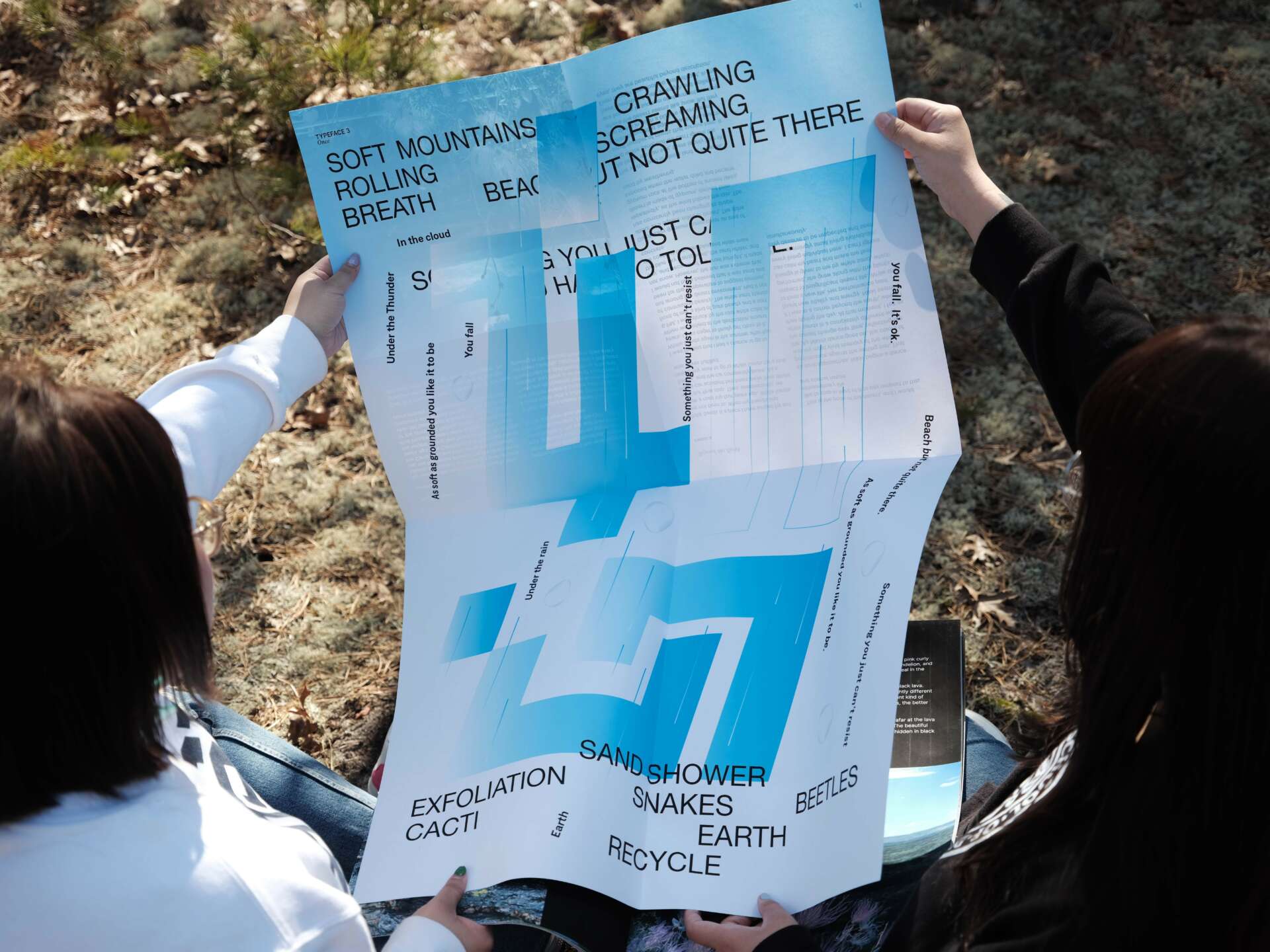
For you, what’s the most rewarding aspect of being a creative?
For me, the most valuable aspect of working in the field of graphic design is that I have the chance to collaborating with cool people from other disciplines. When communicating with them on the project, I learned a lot of things outside my major and field, which opens my mind, and offers me different ways of reading this world. That excites me. Most importantly, the knowledge I learned from them has become my source of inspirations in the future. So I am working while growing.
Any resources you can share with us that might be helpful to other creatives?
I wish I could talking to people about my work more often even though they are still work-in-progess. 
Contact Info:
- Website: https://guozengqi.com/
- Linkedin: https://www.linkedin.com/in/zengqi-guo-a06ab81a5/