
We caught up with the brilliant and insightful Sandra Morales a few weeks ago and have shared our conversation below.
Hi Sandra, thanks for joining us today. What’s been the most meaningful project you’ve worked on?
I started studying graphic design in 2014 at BUAP (Mexico), and during my classes, I discovered something called typography. I began to delve into the history of typography and fell in love with it. Later, in 2017, I did an academic exchange at UNLa (Argentina), and it changed my life. I learned to approach design projects from a typographic perspective, and my vision expanded more and more. That’s when I realized I could learn calligraphy, lettering, and type design, although I didn’t fully understand the differences. In a somewhat naive manner upon my return to Mexico, I started taking classes related to these areas. I began by trying lettering without a solid foundation in letter construction, then jumped into attempting to “type design” and when I got to calligraphy, everything clicked. I definitely don’t recommend that path, haha.
After this exploration, I decided I wanted to pursue a postgraduate degree in typography. It was then that my greatest desires converged: returning to Buenos Aires, my favorite city, and continuing to learn about something I am passionate about – letterforms.
In 2021, my dream came true, and I started studying for a Master’s in Typography at the University of Buenos Aires. For two years, my life revolved around letters. It has been the most challenging experience I have had, and I am only now processing what it meant to live through that. So, the longest and most meaningful project I have worked on is my master’s final project, a typeface called Malinali. It is the result of my interest in linguistic diversity through typography, combined with Mexican culture.
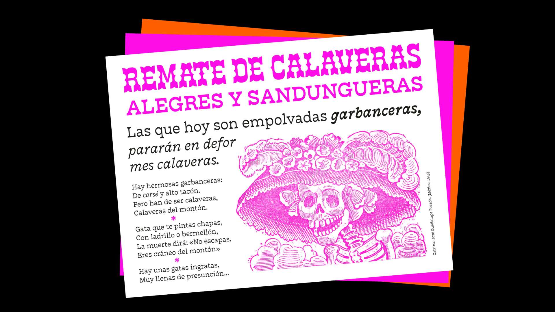
Malinali is a typeface family designed for bilingual publications in Nahuatl and Spanish. It aims to reflect the cultural and linguistic richness of Mexico, drawing inspiration from the cempoalxóchitl flower. This flower is a symbol of Mexican tradition and identity, with significant cultural importance from pre-Hispanic times to the present day, especially during the celebration of the Day of the Dead.


Sandra, love having you share your insights with us. Before we ask you more questions, maybe you can take a moment to introduce yourself to our readers who might have missed our earlier conversations?
I am Sandra Morales, a type and graphic designer from Puebla. A significant aspect of who I am is that I perceive the world through letters, and my driving force is the satisfaction I derive from learning new things.
One of my proudest achievements is realizing goals that begin with a desire to learn, and these achievements become even more meaningful when I have the opportunity to meet incredible people along the way. One notable experience was the typographic tournament organized by the Letrástica community, where I had the chance to collaborate on my first typographic project with amazing designers like Tam Segura, Ro Hernandez, Aspacia Kusulas, and Karla Mateos. Our collaborative typeface, Acrata, is an open-source typeface designed to resist patriarchy and low-resolution rasterization.
Through this experience, I also connected with more Mexican designers, and we became close friends. Together, we formed a community of Spanish-speaking women passionate about the diverse visual representations of letterforms, known as Times New Woman (www.instagram.com/tnwoman_/).

Any resources you can share with us that might be helpful to other creatives?
I consider myself a quite organized person, and I plan everything well in advance. Visualizing the future I desire helps me know what small steps I need to take each day. However, I often find myself reflecting on my decisions and evaluating the path that has brought me here. Previously, I mentioned that I do not recommend the path I took to learn about typography, calligraphy, and lettering. Sometimes, I think I would have liked to approach it differently, but I believe that naivety and lack of knowledge helped me explore with more freedom, and the mistakes I made turned into valuable lessons.
I’ve had great opportunities, such as being a recipient of the Malee Scholarship in 2021, which helped finance my master’s degree and also included an incredible mentorship with Sharptype. Now, when I reflect on that experience, there are times when my self-demanding makes me think that I did not take full advantage of it because my knowledge was limited at that time. However, everything is a process, and I am very grateful for that experience, which propelled me forward, they were incredibly generous, inspiring, and taught me a lot. I’m glad to have lived through it the way I did; it led me to where I am now. I know there is much more to explore, and that’s what makes it exciting.


What’s the most rewarding aspect of being a creative in your experience?
I believe the most rewarding aspect of being in the typographic industry is the community that forms around the shared passion for letterforms. It’s truly exciting to meet new people and feel a connection when you see them admiring street signs, find it fascinating to explore libraries and see ancient books, or even visit cemeteries to appreciate gravestones. It’s wonderful how this affinity for letters can bring together individuals from different places and cultures into a community.
My most recent experience with this is my type-tribe that emerged during my master’s program. Having classmates from various Latin American countries (Colombia, Chile, Ecuador, Brazil, Argentina, and Mexico) added a beautiful mix of accents, ways of naming things, and unique perspectives to that experience. I am very grateful to know them and to share that journey with them.


Contact Info:
- Instagram: www.instagram.com/typeofshe/
- Linkedin: www.linkedin.com/in/sandramo/
Image Credits
Portrait by Sofía Uriarte