We were lucky to catch up with Kathryn Grube recently and have shared our conversation below.
Kathryn , thanks for joining us, excited to have you contributing your stories and insights. Let’s jump right into how you came up with the idea?
After graduating with a bachelor’s degree in interior design n 1998 from East Tennessee State University, I started my career in residential kitchen and bath design and small-scale interior design projects. While pursuing my interior design degree that I was very fortunate to be mentored by an adjunct professor there who specialized in using color in design who held an incredibly successful high end interior design firm stemming from her own education including a master’s degree with a focus on color design from the University of Tennessee. She opened my eyes to a love that has been instilled in me since childhood and exposed me to a world of wondrous opportunity in successfully designing interior spaces with color. Although functional color as a design was not yet fully revealed, my journey of understanding color theory and applying it as a successful design element in creating functional and aesthetic interiors began to flourish.
After a year in residential design, I was approached to enter the commercial design market. Being a broke college student weighed heavily and so I decided to take the position with a company with headquarters in Columbia, South Carolina who specialized in custom casework, millwork, seating, and furnishings. The bulk of our work was in large scale projects within the educational, healthcare, and industrial related (laboratory, federal government, and military) design industries. After gaining a few years of experience watching these projects develop from concept to completion and having an interior design background with the love of color, one thing I could never understand is why the majority of the educational facilities we completed typically had values of white applied to all the walls within their classrooms instead of color. We were trained to understand the value of color and how it affected mood and set the stage for all successful interior projects and in the place where we can spend up to 1/3 of our lives, architects and designers were using a blank palette of white that actually caused a detriment to learning.
After completing 15 years in industry and moving seven times over a span of five states all within 12 years, the design and construction industry fell victim to the recession in 2008 and the work immediately stopped. I was working as a director of operations then and stationed in San Diego, CA about to take on a five-year tenant upfit in Hawaii and move there to oversee its success. As we all can remember, most design and construction ceased without warning and projects all went on hold. I was in uncharted waters as my position was unable to continue and I was laid off until future notice unknown. After exhausting efforts to find other substantial employment, I decided to return to the university scene and further my interior design education to gain a terminal Master of Interior Design degree to teach professionally on a higher education setting. Both of my parents were in the educational industries with PhD’s from the University of Michigan, so it was a natural path that had a support system already set in place. Once being accepted to Lawrence Technological University in Southfield, Michigan, I had no question of what my master thesis would be about to enable the body of academic knowledge to gain awareness and understanding of how white walls were the choice of color design applications used extensively within our classroom environment environments and why. My master thesis was titled , “Why don’t we have colored walls in our classrooms?” and the birth of functional color began.
After completing my master thesis and gaining extensive research increasing my own awareness and understanding of the hows and whys of why white is used as a go to in design for classrooms, I wanted to know more. One person who continually stood out in the research findings was Mr. Frank Mahnke. Mahnke was a color scientist and architect who spent his life studying how color can influence the body and mind within the built environment. He was mentored by Mr. Faber Biren another person exceptionally well known as being one most influential researchers, practitioners, and author of over 226 books educating the strategic use color. After being in awe and inspired by these great men, I reached out to Mahnke with hopes that he would receive my letter and help guide me in my journey of what I now knew I was born to do: help continue his work and find my place in it to change the world of design through functional color. He not only responded to my letter, but picked up the phone and called me. I was star struck in amazement. I sent him a copy of my thesis and he was enamored by the research findings and invited me into “the circle of color scientists, artists, and color canvassers” of his world. Mahnke was the president of the International Association for Color Consultants and Designers (IACC) of North America who shared his extensive research findings in a series of four rigorous seminar and training workshops with each having design projects required for completion in achieving a professional IACC membership certification. He wanted me to become a part of this great association and comped my entire tuition to attend and complete my certification. It took me three years.

Great, appreciate you sharing that with us. Before we ask you to share more of your insights, can you take a moment to introduce yourself and how you got to where you are today to our readers
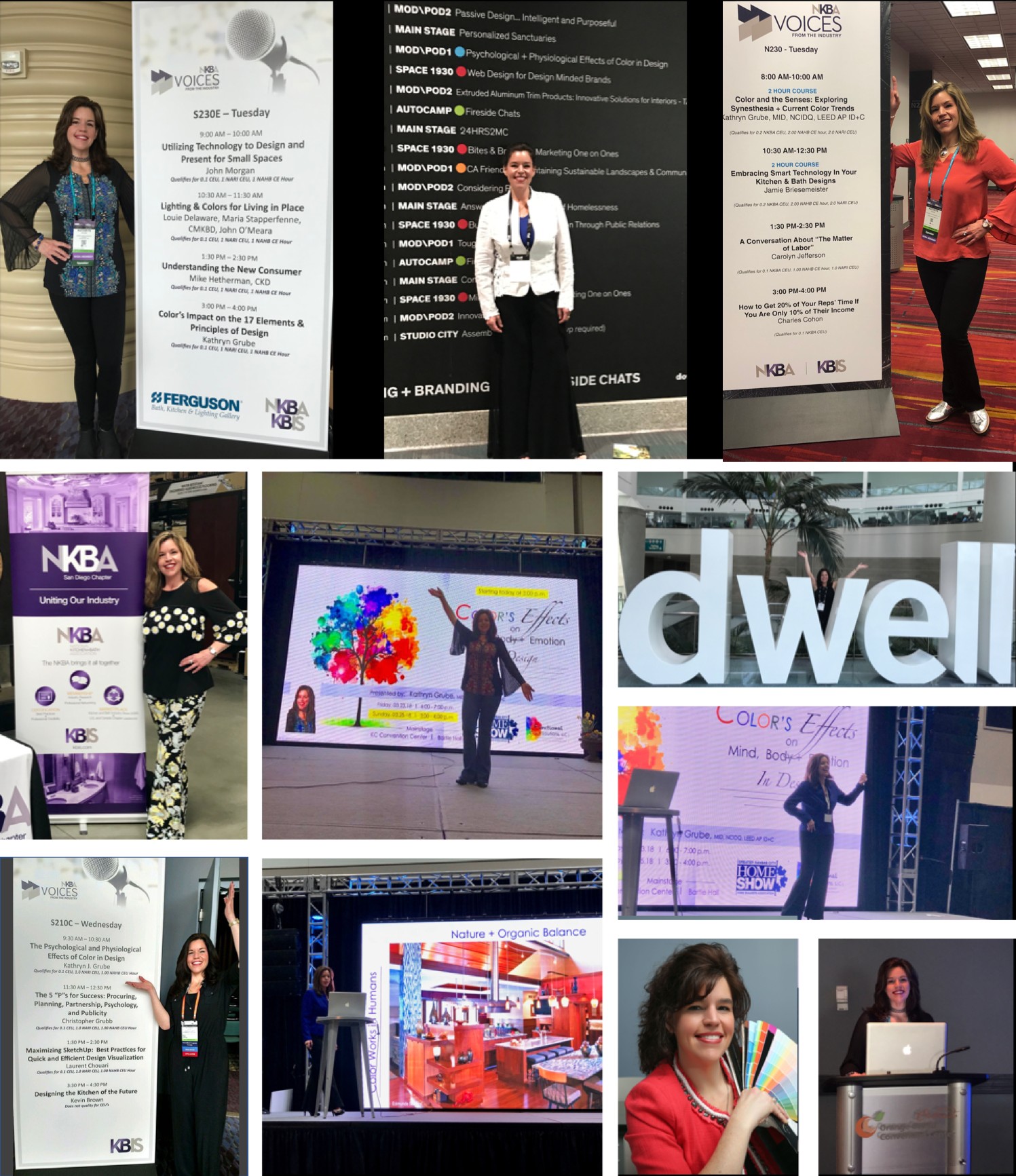
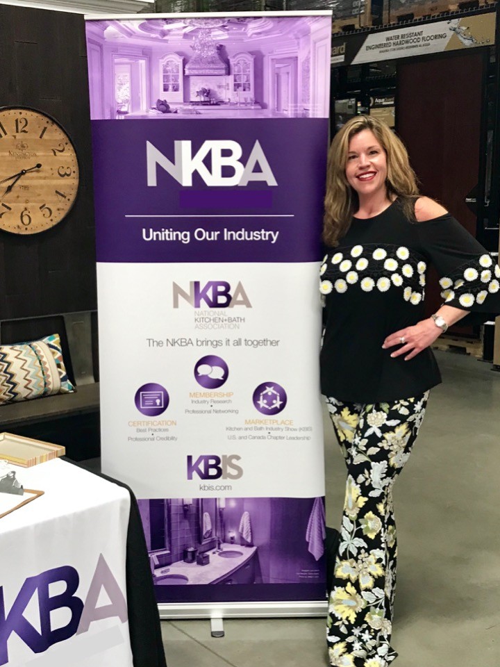
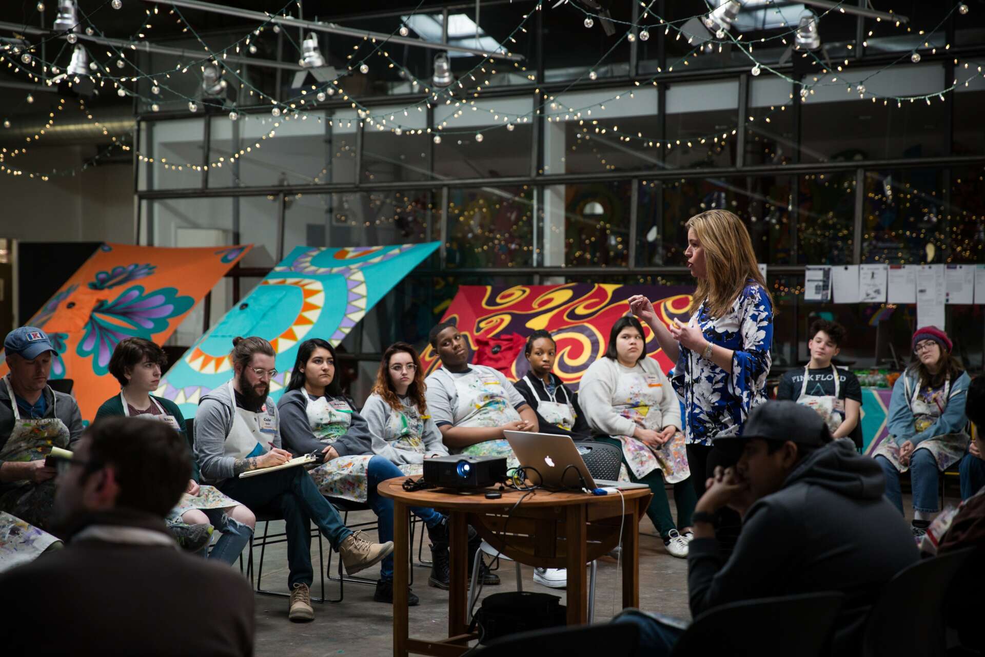
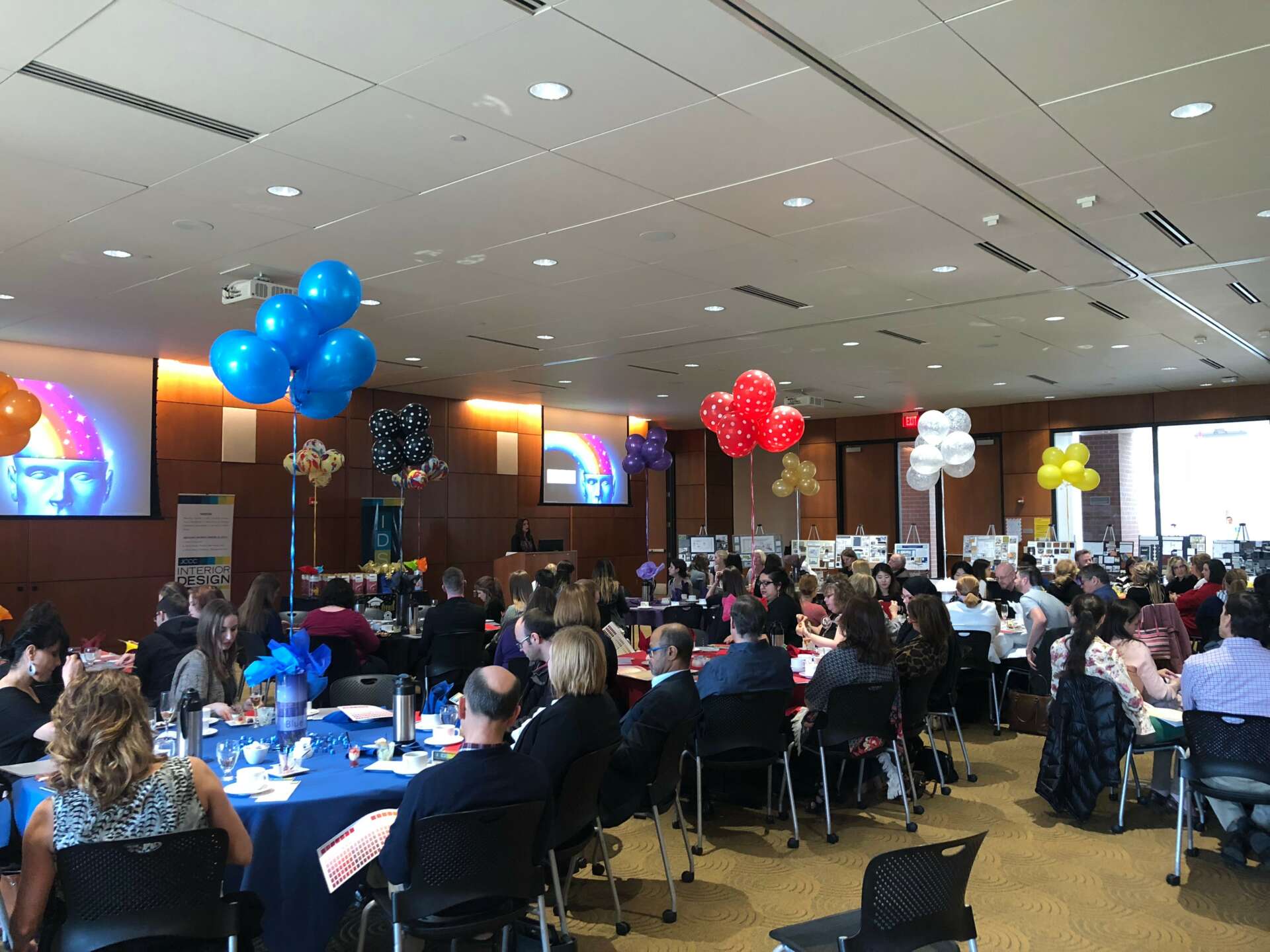
After gaining a fresh new world of knowledge and understanding, I was more inspired more than ever. I began my professorship in interior design during my IACC certification process and was teaching full time at Johnson County Community College in Overland Park, KS within their reputable two year associate’s degree interior design career program. It allowed me to share my knowledge with the students who were ultimately the future of our interior design industry. It was there that I began to develop my name as a respected college professor who specializes in functional color design and my career took off. I began to acquire multiple request for color consultation projects for residential and commercial built environments. I was asked to perform CEU’s and guest speaking on a national scale and share my awareness and understanding of how color can be used responsibly and affect the outcomes of space intended tasks in a beautifully aesthetic way. The CAO of the college approached me with the task of redesigning the color selections for classrooms and offices for 200 Acre campus with student enrollment now exceeding 44,000 students. The project won a national award for functional color design in 2017.
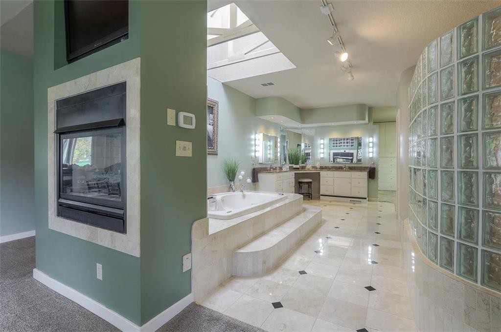
My specialty is on functional color. Functional Color applies strategic design techniques that skillfully implement responsible color design strategies fusing evidence-based color research and scientific principles. Interior spaces can be transformed into performance-driven environments based on end user needs. Psychological + physiological responses are triggered from the mind and body influencing positivity in health, mood, behavior, and emotional well-being. Functional Color is NOT about non-sustainable color trends or picking a color out of the crayon box simply because it’s “pretty”. It is about using responsible design strategies that allow us to expect more from the spaces where we live, work, eat, sleep and play.
Is there a particular goal or mission driving your creative journey?
Functional Color uses the natural power (wavelengths) of color to connect human beings to the natural environment. We ourselves are organic beings. We are made up of about 70% water, we are born, we grow, and we flourish with proper food and sunlight. People need sensory variety to thrive and we innately crave being close to nature, and all of its varieties of shapes, patterns, and colors to achieve well being.
With this known, goals are to team up with a national or international brand paint manufacturer and lighting manufacturer and spread the possibilities of using functional color design to help the masses implore positivity in our interiors through responsible color design.
• Market color in a fresh way, First of its kind: offer Functional Color paints paired with Functional Color full spectrum light bulbs to an all-inclusive market of design professionals + DIYers. Educate color awareness, its functional properties, and share the possibilities of what each hue can do to enhance well-being in interiors. (* Note: Paint coatings must have a welded partnership with full spectral lighting to achieve a true color experience for the greatest success.)
• Employ our foundational, organic makeup and develop new colors (possibly with some type of new color depth technology?) that mirrors the organic elements of nature. ( Offering the world’s most magnificent views of nature in a paint can…(offering tints + shades of each color value for personal preference). Utilize + channel the evidence-based color research, case studies, and scientific principles characteristic wavelength properties to:
• Promote positive behavior & emotion
• Stimulate creativity
• Increase employee productivity
• Stimulate or suppress appetite
• Increase memory
• Help counter shock, fear, & addiction
• Reduce absenteeism + vandalism
• Increase safety / security / comfort
• Generate muscle energy
• Increase academic performance
• Help speed and increase healing
• Lower blood pressure & heart rate
• Invigorate more oxygen into the brain
• Relax muscles + deepen breathing
• Boost mood + morale and attitude
• Promote better overall emotional wellness

Is there something you think non-creatives will struggle to understand about your journey as a creative? Maybe you can provide some insight – you never know who might benefit from the enlightenment.
Unfortunately, color is a hard sell and science must be tied to the arts and industry to achieve success. Most people are unlearned in understanding of what color even is and how to approach it professionally. Some problems and needs are as follows:
• Color is taken for granted. Color is not taken seriously or used responsibly. There is a lack of awareness for what color can do functionally for the mind and body in our interior spaces.
• Lack of awareness + education that the surrounding color volumes at eye level that are used in residential and commercial built environments do directly affect our mind, body, mood, behavior, and well being.
• Color is typically seen only as an aesthetic preference with no skill set required to select.
• Evidence-based color research, case studies, and scientific principles of light and physics are not readily implemented into building + construction design standards.
• Paint manufacturers + color marketing selections are driven for “entertainment” in an aesthetic vehicle each year based on unsustainable color trends. No strategic responsibility is taken on how the surrounding volume wall paint color will elicit a given psychological and physiological response from the end users who occupy the space.
• Color selection is guided by the sense of sight for immediate gratification or selected to be ”safe” . Most do not have training or interior design skills and want to have something that looks good and is accepted in society, while avoiding the dread of doing something “wrong” or making a fool of oneself.
• Building standards only require a 80% CRI (color rendering index) in light bulbs (lamps) when natural daylighting, biophilic design are high priority drivers to prioritize bringing the outdoors inside for promoting health and well-being. (Pure spectral light is 100% CRI.)
• Lighting manufacturers advertise the color temperature for light bulbs on packaging and are classified in warm or cool or “daylight” tones. The CRI is not indicated. Our circadian rhythm bases our daily cycle for body temperature, cell regeneration, and brain wave activity on true spectral light with a 100% CRI.
These are just some of the obstacles set forth in my journey to educate awareness, develop functional color product lines and overcome the stereo typically challenge of mere color preference within the world of interior design.
Contact Info:
- Website: https://www.functionalcolorsolutions.com/
- Instagram: @functionalcolor
- Linkedin: linkedin.com/in/kathryn-grube-mid-ncidq-leed-ap-7b5a1815
Image Credits