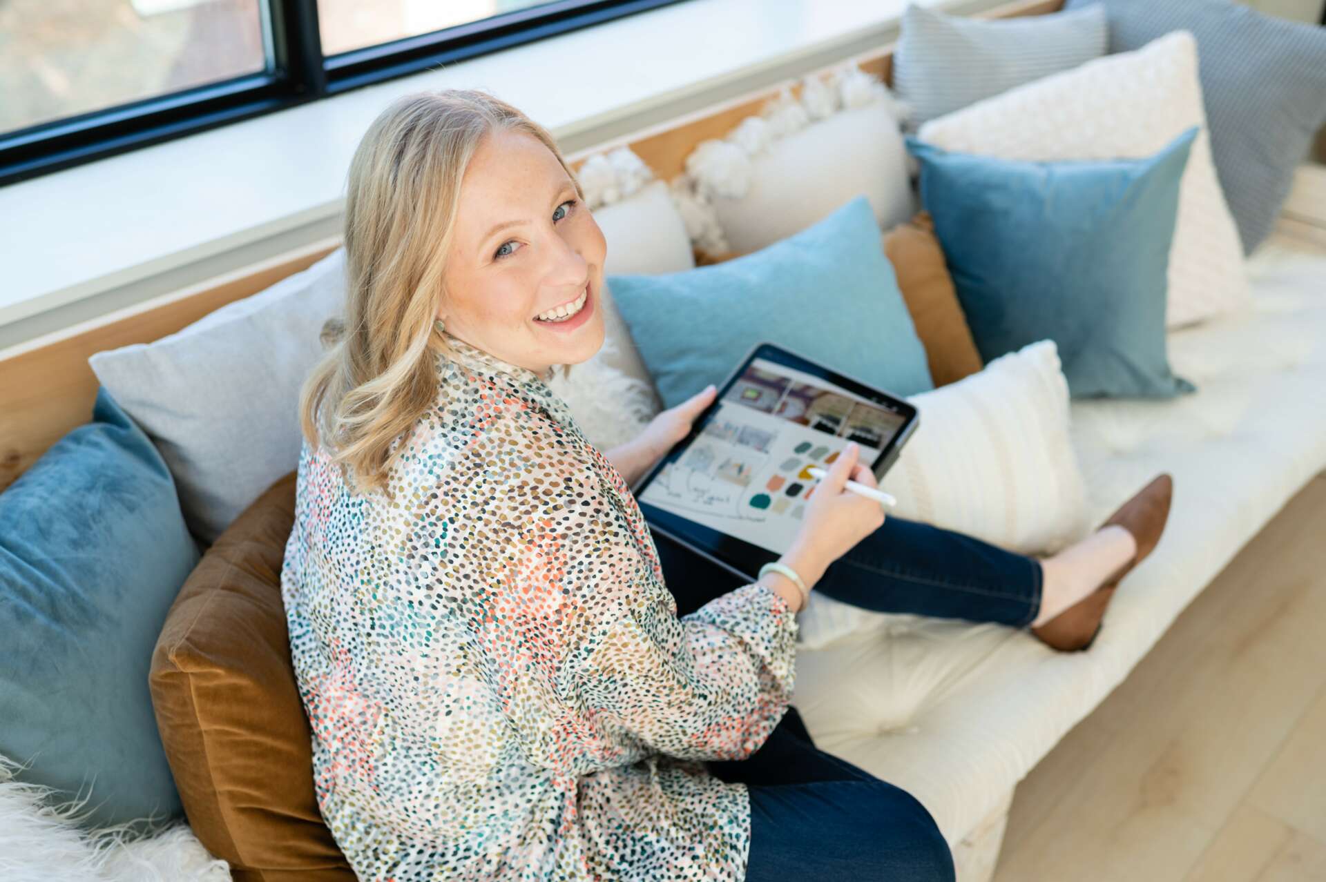
We were lucky to catch up with Stephanie Audette Connor recently and have shared our conversation below.
Hi Stephanie, thanks for joining us today. We’d love to hear about a time you helped a customer really get an amazing result through their work with you.
Over the past six months, I’ve had the chance to help a mom-founded business on a mission to help people build their families.
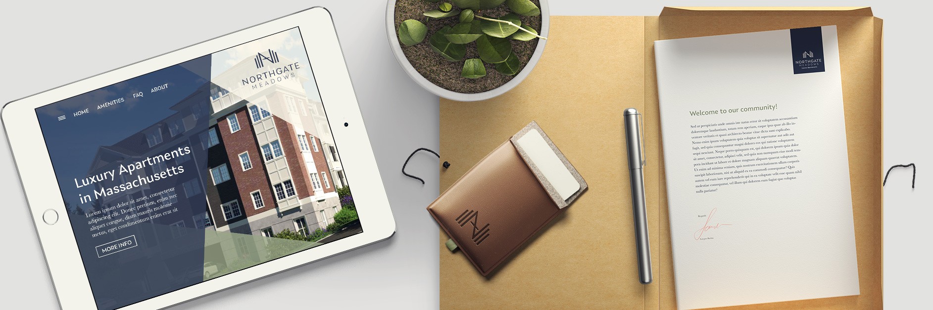
PherDal Fertility Science, founded by Dr. Jennifer (Jenn) Hintzsche, Ph.D., is a small business offering an alternative to expensive assisted reproductive technology for those struggling to conceive. PherDal has developed the first FDA-cleared, sterile at-home intracervical insemination (ICI) kit. This patent-pending at-home fertility treatment was designed by Jenn, a scientist with a Ph.D. in bioinformatics, and her husband Ryan, an engineer, after they struggled with their infertility diagnosis.
When I first met Jenn through a networking community in fall 2022, we clicked immediately. My own fertility struggles made her business’s mission especially resonate with me. She needed a new box design for PherDal that complied with FDA requirements. I said I’d be glad to help. We determined that updating her visual brand identity before redesigning her packaging was a smart move, so that was where we began.
Small Changes; Big Impact
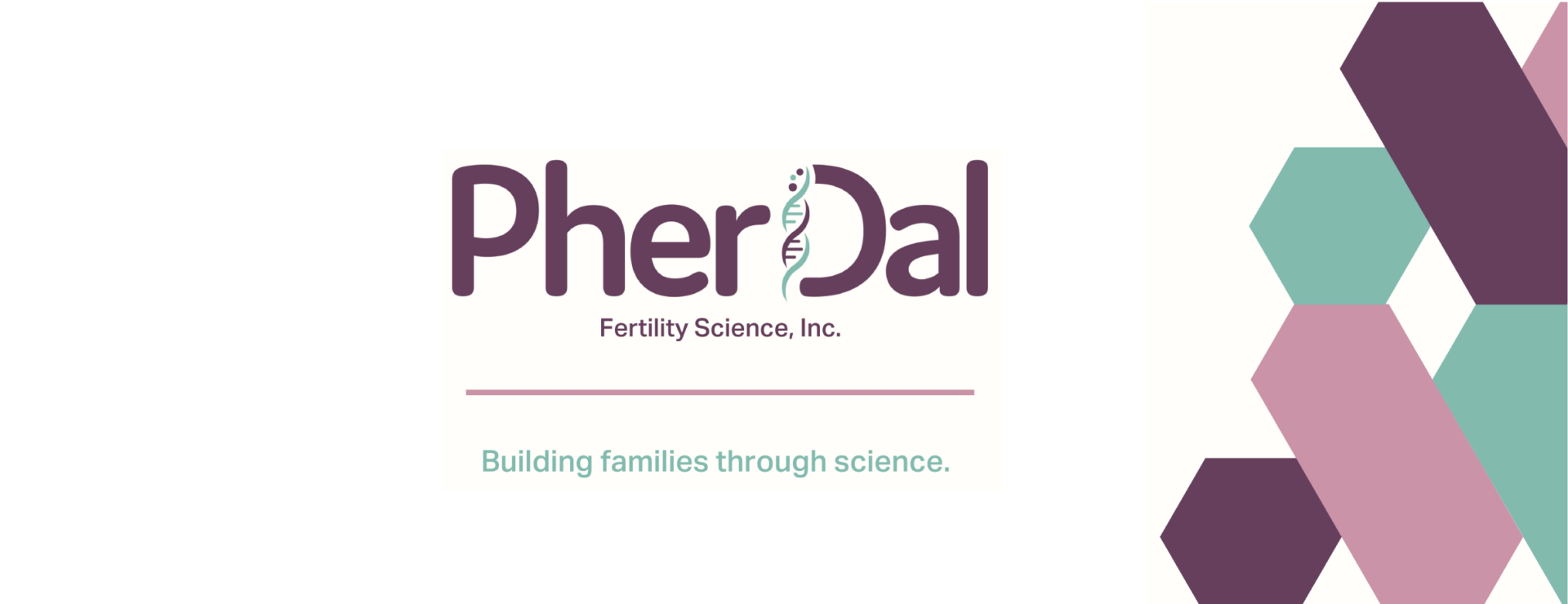
PherDal’s original logo and color palette were mostly DIYed with the help of a marketing person. The branding had a lot of great elements but needed some tweaks to take things to the next level.
Here’s a look at the original branding:
And this is the updated face of PherDal:
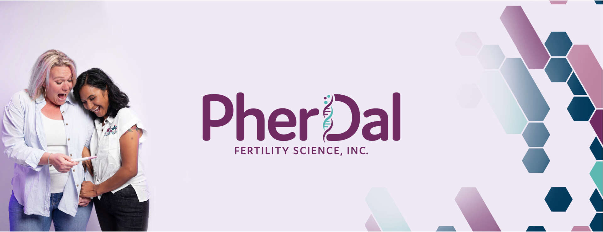
You’ll see that while the adjustments were subtle, they made a significant impact.
- Brighter Colors
By using more saturated tones, we increased the vibrancy. - Better Kerning
We expanded letter spacing in the brand name for legibility. - Custom Pattern Design
We developed a bold, branded pattern to use across various digital and print assets. - Neater Graphic Spacing
We fixed the spacing and angle of the DNA strand that forms the line of the letter “D” in PherDal.
Applying the New Branding to Packaging Design
Once we updated brand design, it was time to redesign the box. We knew that PherDal’s packaging needed to:
- Meet FDA requirements by including specific information
- Incorporate the updated branding using 2-color printing for cost-savings
- Be made of the heaviest weight (Level B) cardboard to protect the medical equipment inside
- Limit all branding to the inside of the box for discrete shipping
This is the original shipping box:
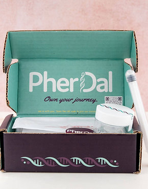
And this is the updated box:
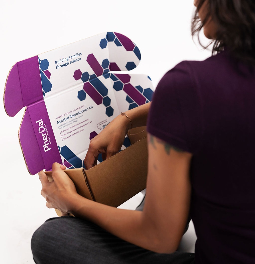
We incorporated the new branding, updated the typography for consistency, and even included a QR code to access video instructions for how to use the device.
Developing a Deck that Opened a Door—to SXSW!
After these initial projects, I’ve been pleased to continue partnering with PherDal as they grow. For instance, Jenn knew she needed to update her pitch deck with the new branding, and with a big investor meeting around the corner, she reached out in January 2023.
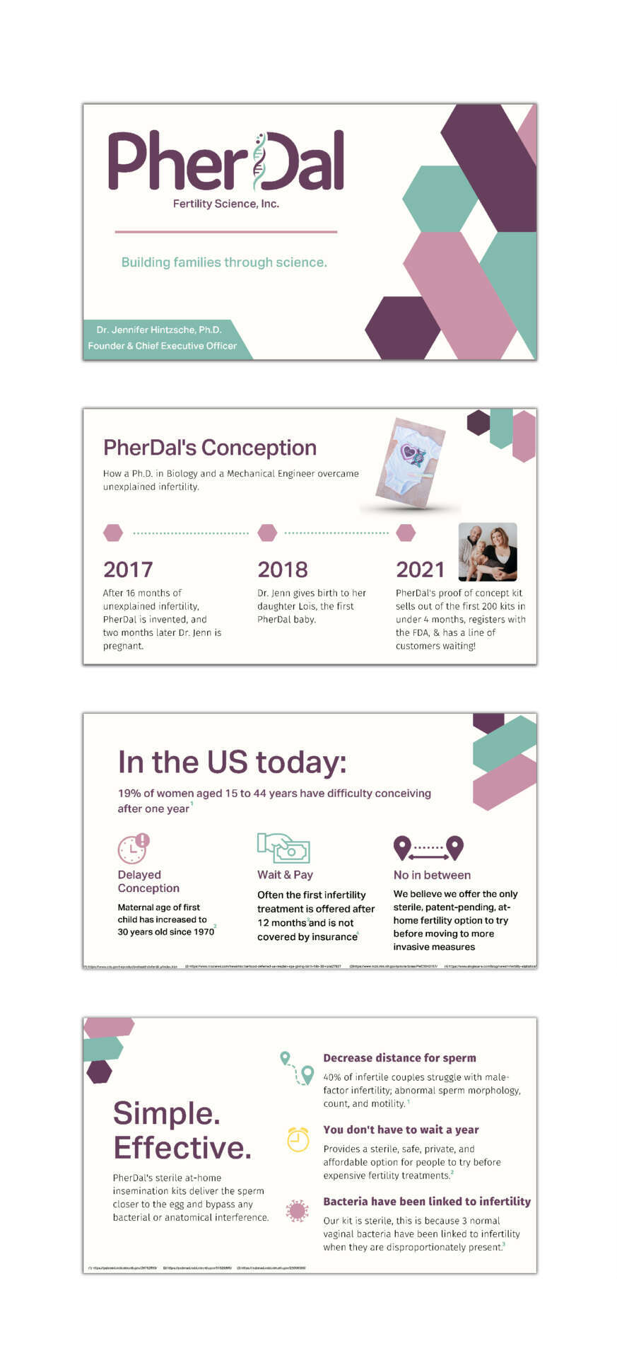
Here are a few slides from her original deck:
And here are the updates:
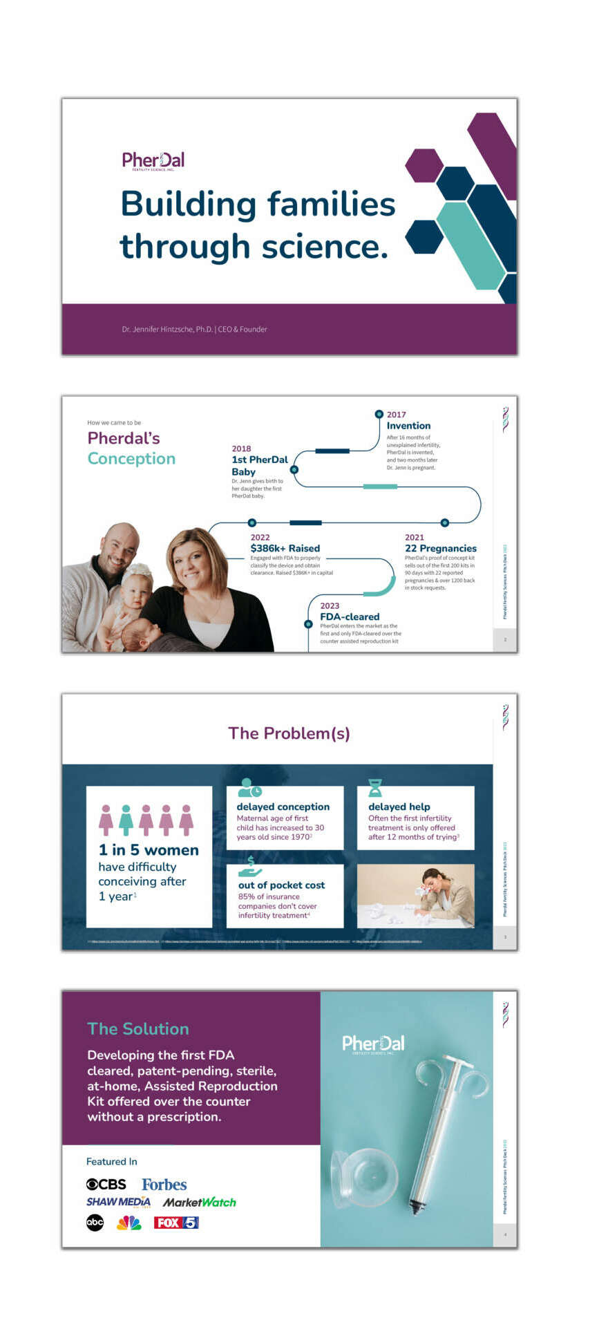
Updating colors, fonts, and logos were obvious to-do items, but my process for this deck was also about achieving powerful communication. Here are a few of the changes I made to reach this goal:
- Increasing white space and brightening the background to make the slides easier on the eyes
- Tightening up dense text and adding headings and subheadings to guide audience members more easily through the content
- Creating and updating infographics to capture complex ideas impactfully
- Creating typographical hierarchies to direct readers eyes to the most important information first
“I thought I had done a great job with my pitch deck, and I had . . . from a content perspective. All of the critical components were there to communicate my problem, solution, and business model. However, based on Stephanie’s previous work for PherDal, I knew that she would be able to give our deck the extra dose of professionalism it needed. She didn’t just give our deck a little additional wow factor—instead, she turned it into a masterpiece,” shared Jenn. “Everyone from our board to our investors was blown away by her presentation of the content in a unique, beautiful, and convincing fashion. Thanks to Stephanie, I successfully pitched and was selected to the famous and prestigious South by Southwest ® (SXSW) Pitch Competition, where I can’t wait to show off her designs to thousands of people. I know the return on this investment will be several hundredfold. Stephanie took my vision and turned it into a beautiful reality.”
PherDal’s SXSW invite is a testament to how powerful design can be when getting your message into the world. In PherDal’s case, it helped engage investors and open up the door to a huge opportunity.
Growing Brand; Evolving Needs
It has been so satisfying to watch PherDal apply its new branding in a variety of ways—with my help and on their own. For instance, I updated PherDal’s free ovulation tracker (get yours here if you’re trying to build your family!) and plan to update the design for instructions accompanying the device. PherDal has also been using its Brand Identity Guide to create on-brand social media graphics, update the look of its website, and more.
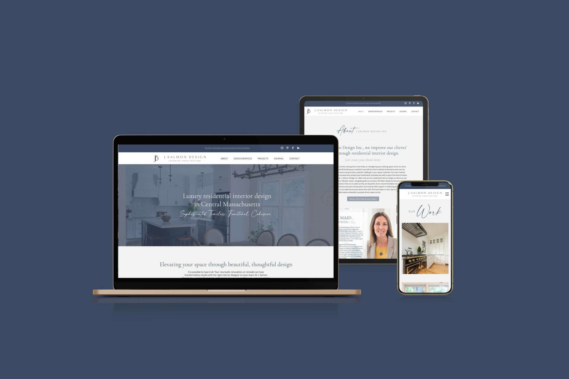
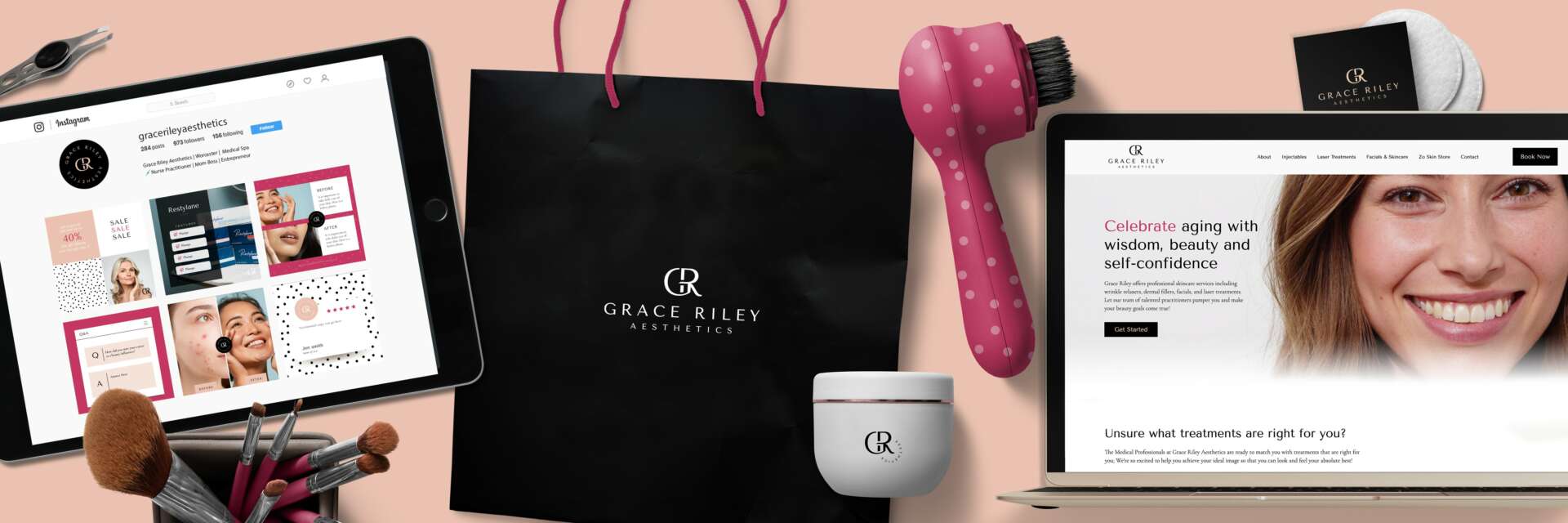
There is real power in a strong, holistic approach to brand design, and I love helping businesses like PherDal reach more people and grow by putting forth a sharp, professional image.
Stephanie, love having you share your insights with us. Before we ask you more questions, maybe you can take a moment to introduce yourself to our readers who might have missed our earlier conversations?
After graduating from Massachusetts College of Art and Design with a Bachelor of Fine Arts in Graphic Design, I found myself back home struggling to find a job. For nearly three months, I applied for every graphic design job in Worcester County. I even sent my resume to numerous creative agencies who weren’t hiring!
When I wasn’t job searching, I spent a lot of time at a young startup in Millbury, MA called Cre8: A Do-It-Yourself Studio. Eventually, the owner created a position for me. I spent a few years working there alongside her, helping people to design and produce various items. After working at Cre-8, I got my first full-time job as a designer and worked for a few years at a couple of agencies. It wasn’t long before I realized my creativity and ambition couldn’t be satisfied by laying out newspaper ads.
I wanted to be in control of my process and have the opportunity to really connect with my clients, working alongside them every step of the way. I started taking on freelance design jobs while working as a part-time financial assistant. It was so satisfying, and I had finally found my calling as a designer! Once I had built my clientele and portfolio, I made the leap to open my own full-time design studio on January 1, 2016.
Metrowest and Central Massachusetts are exciting places to be working right now. Worcester, in particular, is going through a renaissance. The activity, energy, and innovation throughout the city captivate me and draws me in. Many new and evolving small businesses and startups are committed to keeping their dollars local and working with fellow small businesses to achieve their goals. I love being able to play a small role in their success stories!
What’s been the most effective strategy for growing your clientele?
Cultivating relationships. Time and time again, my best clientele and projects come from referrals. Continuously networking and making real-life connections and friendships within the creative community has always paid off.
What do you find most rewarding about being a creative?
I love being able to create on my own terms, use my own ideas, and my own process without having a boss tell me how to design.
Contact Info:
- Website: https://www.stephanieaudette.com/
- Instagram: https://www.instagram.com/audette_stephanie/
- Facebook: https://www.facebook.com/worcesterbranding
- Linkedin: https://www.linkedin.com/in/stephanieaudette/
Image Credits
Credit for headshot type image – Tamara Merri Photography