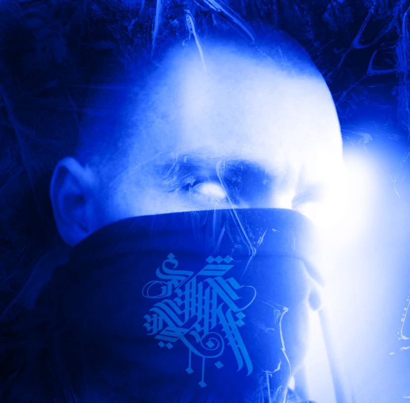

We’re excited to introduce you to the always interesting and insightful Just Zero. We hope you’ll enjoy our conversation with Just below.
Just, looking forward to hearing all of your stories today. We’d love to hear the backstory behind a risk you’ve taken – whether big or small, walk us through what it was like and how it ultimately turned out.
I’ve always believed it’s riskier not to move.
Staying in the “what if,” circling half-formed ideas, waiting for certainty — that’s the real gamble. I’ve never been reckless, but I’ve consistently chosen the path where growth was unavoidable. I tend to bet on outcomes where I win either way. If something succeeds, that’s great. If it fails, I leave with skill, experience, and clarity. Those are assets no one can take back.
Design school was a risk. The cost was high, and the reward wasn’t guaranteed. But I walked away with an education — not just in software or aesthetics, but in how to think, critique, and refine. That foundation compounds over time.
Taking a web design job early on was another risk. I didn’t know how to code. I didn’t know how deep the technical side went. I just stepped in and learned under pressure. Ten years later, I’m building my own systems — even coding a custom font generator. That’s the long arc of risk. You don’t see the outcome at the beginning. You commit to becoming the kind of person who can handle it.
Art itself is a risk. It’s vulnerable. Most projects don’t explode into visibility. Most experiments don’t become breakthroughs. There are more quiet losses than public wins. Calling myself a type designer is a risk too — there are people who have been doing it longer, better, at a higher level. But titles aren’t declarations of superiority. They’re commitments. If I say I’m a type designer, that means I’m showing up to the work, studying it, refining it, and improving year after year.
For me, risk has never been about bravado. It’s about trajectory.
I would rather accumulate skill than comfort. I would rather walk away from a risk having learned something than sit still protecting a version of myself that never evolves. Over time, that mindset compounds. A decade later, you look back and realize every “risk” was just a stage in becoming more capable.
And capability is never wasted.
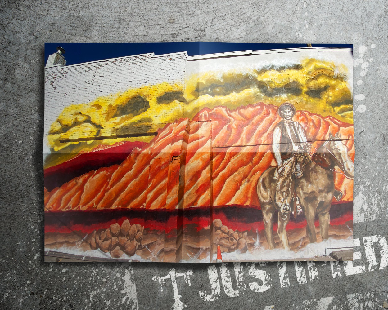
Awesome – so before we get into the rest of our questions, can you briefly introduce yourself to our readers.
I’m the Founder and Principal Designer of Justified Ink — a design studio, type foundry, and evolving archive built around lettering, systems, and disciplined creative practice.
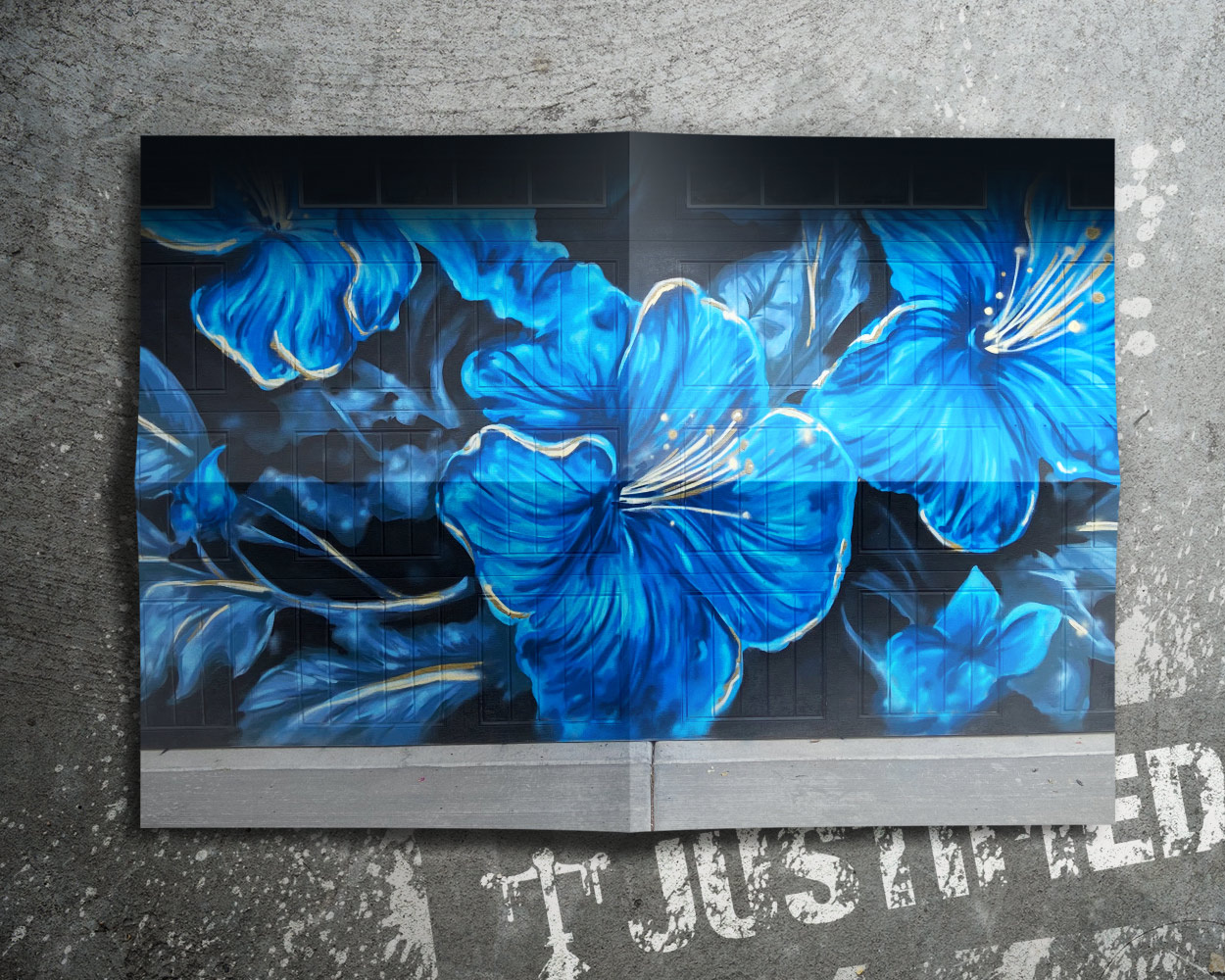
I’ve been making art for over two decades. What started with spray paint and handstyle evolved into formal design education, web development, branding, typography, and product creation. I’ve moved between physical and digital mediums my entire career, and that cross-discipline experience is what defines my work today.
At its core, my mission is simple: to validate artists and designers.
There’s a lot of pressure in creative industries to be groundbreaking — to reinvent everything, to be louder, faster, more disruptive than the next person. I don’t believe that’s the real goal. The real breakthrough is breaking ground in your own way. Developing depth. Developing fluency. Building skill over time until your work carries weight because of repetition and refinement, not because of hype.
Everything I build under Justified Ink reflects that belief.
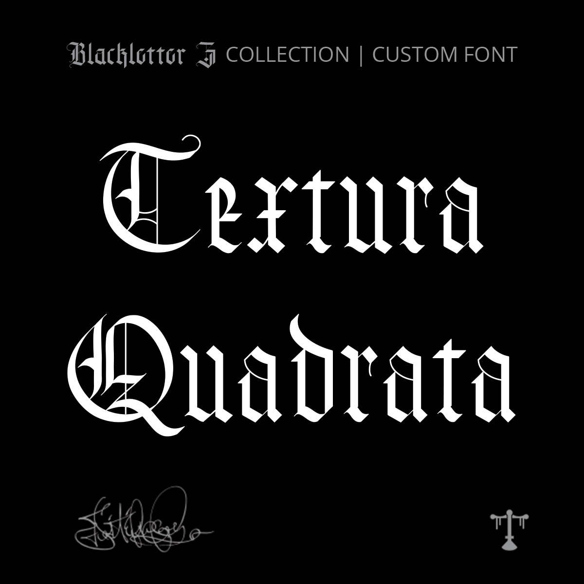
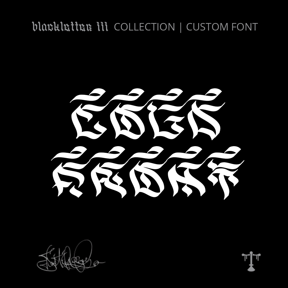
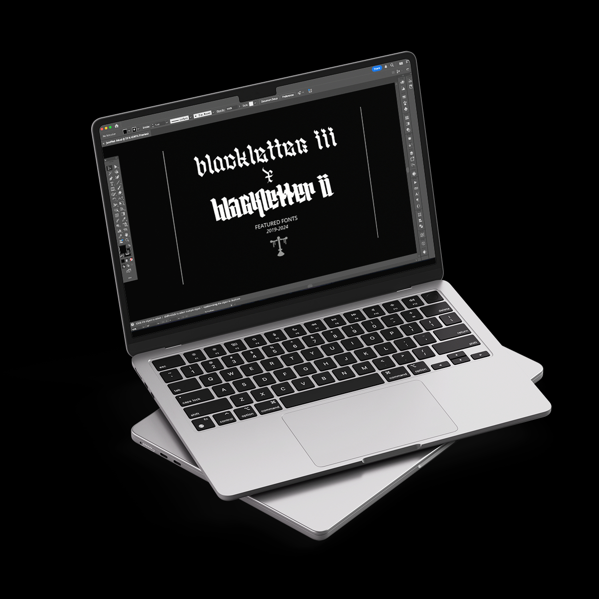
I design and sell fonts — but every typeface is hand-crafted by me. Many of them are deeply stylized, rooted in blackletter traditions, graffiti influence, historical scripts, or experimental forms that don’t always appeal to mainstream design trends. They’re not built to chase mass appeal. They’re built with structure, lineage, and intention.
And while they may not be for everyone, for the right designer, they’re exactly what’s needed. They offer voice where generic options fall flat.
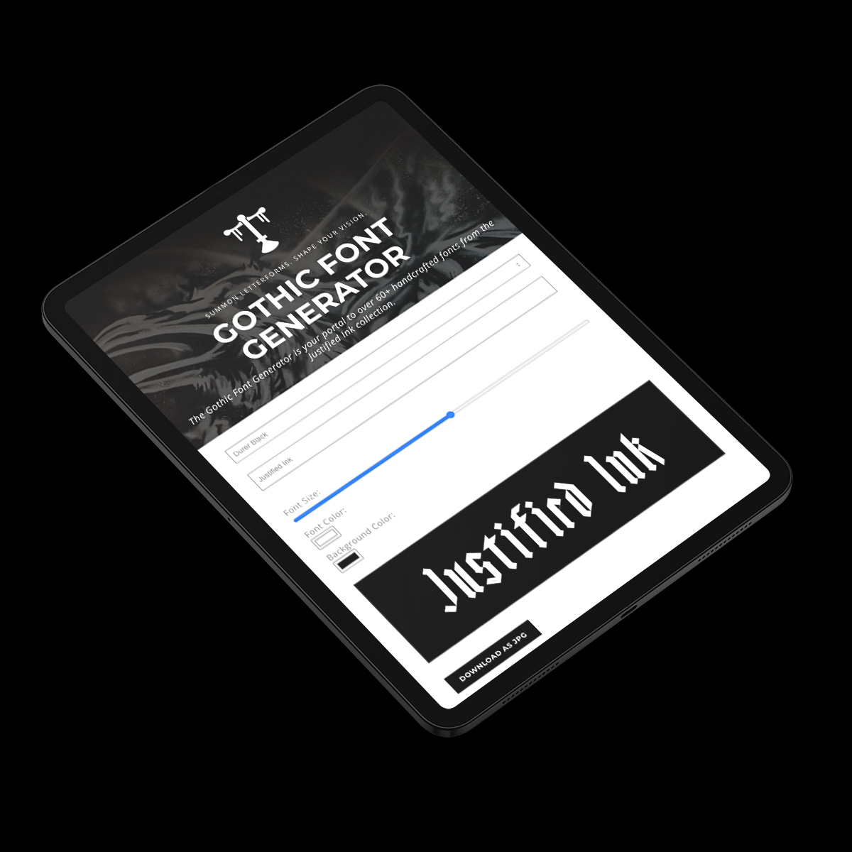
One of the most important extensions of that philosophy is my font generator. It began as a way to let people experiment freely — to type in their name or a phrase and instantly see it rendered in different gothic and stylized forms. What surprised me is how much momentum it’s gained. It’s now becoming a cornerstone of the brand. It lowers the barrier to entry. It allows curiosity without commitment. It validates interest before someone invests time or money.
It’s not just a marketing tool — it’s an invitation. It tells people: you don’t need permission to explore this aesthetic. Try it. See how it feels. If it resonates, go deeper.
Beyond digital type, I also curate and sell art supplies. Yes, spray caps and tools exist everywhere. But mine are selected from experience — based on hundreds, even thousands of hours of use. They’re not random inventory. They’re the tools I trust in my own practice. That distinction matters. It’s a curated extension of the work, not a generic storefront.
The same applies to apparel. There are thousands of clothing brands. I’ve been making and wearing my own pieces for over twenty years — refining fit, print quality, texture, and durability. The apparel I release now is an expression of my worldview and artistic sensibility. It isn’t trend-based. It’s continuity made wearable.
What sets me apart isn’t volume or trend forecasting. It’s integration.
Fonts connect to practice sheets.
Practice connects to tools.
Tools connect to apparel.
Apparel reflects the philosophy behind the archive.
Everything is part of one ecosystem.
What I’m most proud of is the long arc. The fact that I can look back ten years and see measurable growth in skill, technical capability, and clarity of vision. I’ve gone from not knowing how to code to building my own interactive typography tools. From experimenting with handstyles to constructing structured type systems. From making pieces for myself to building a brand that resonates with others.
I’m not trying to be the loudest voice in design. I’m building something durable.
What I want people to understand about Justified Ink is this: you don’t have to be the most groundbreaking artist in the room. You have to be the one who stays with the work. If you commit to refinement, if you practice deliberately, if you treat obsession as devotion rather than distraction, you will build something meaningful.
My role is to create tools, systems, and artifacts that support that process — and to remind artists that their path doesn’t need to look like anyone else’s to be valid.
That’s the work.
Can you share a story from your journey that illustrates your resilience?
Resilience, for me, has never been dramatic. It’s been iterative.
The clearest example is the evolution of my type work — and ultimately, the creation of my Justified Ink font generator.
When I first started seriously studying letterforms, I wasn’t good at it. I had enthusiasm, background in graffiti and design, but translating that into structured, functional type systems is a completely different discipline. Letters are unforgiving. They expose inconsistency immediately. Rhythm, spacing, stroke logic — you can’t fake those things for long.
Resilience began with the willingness to be bad.
I spent years drawing, redrawing, studying historical blackletter forms, experimenting with graffiti influence, building hybrid styles that didn’t neatly fit into categories. I wasn’t trying to be groundbreaking. I was trying to understand structure. To build a personal library of styles that felt earned.
Over time, that library grew — not just visually, but mentally. I began to understand why certain forms worked, how pressure translated into digital curves, how spacing could change the entire voice of a word. That’s when the practical shift happened: I started turning these styles into usable fonts.
And that was another stage of humility.
Designing a letterform is one thing. Engineering a font is another. Kerning tables, character sets, usability across applications — there’s a technical side that demands patience. Again, I had to be willing to be inexperienced long enough to improve.
As the collection grew, the next challenge wasn’t artistic — it was strategic. How do you present highly stylized, historically influenced typefaces in a way that people can actually experience? Many of my fonts don’t immediately appeal to mainstream designers. They’re too specific. Too stylized. Too rooted in blackletter and underground influence.
I realized that if people couldn’t see themselves in the type, they wouldn’t take the next step.
That insight led to the font generator.
At first, it was simply an idea: what if anyone could type their name or a phrase and instantly see it rendered in these styles? No barrier. No purchase required. Just interaction. Curiosity without pressure.
Building it required another expansion of skill. I had to lean into coding more seriously, understand how to structure it properly, design the interface, optimize performance. It became a convergence point — art, engineering, business, user experience.
Today, the generator is gaining real search momentum. It’s becoming a cornerstone of the brand. But what people see as a single tool is actually the result of layered resilience:
The willingness to be bad at lettering.
The patience to build a private archive of styles.
The discipline to turn those styles into functional fonts.
The business awareness to release them thoughtfully.
The empathy to know users need interaction before investment.
The technical adaptability to build the system that delivers it.
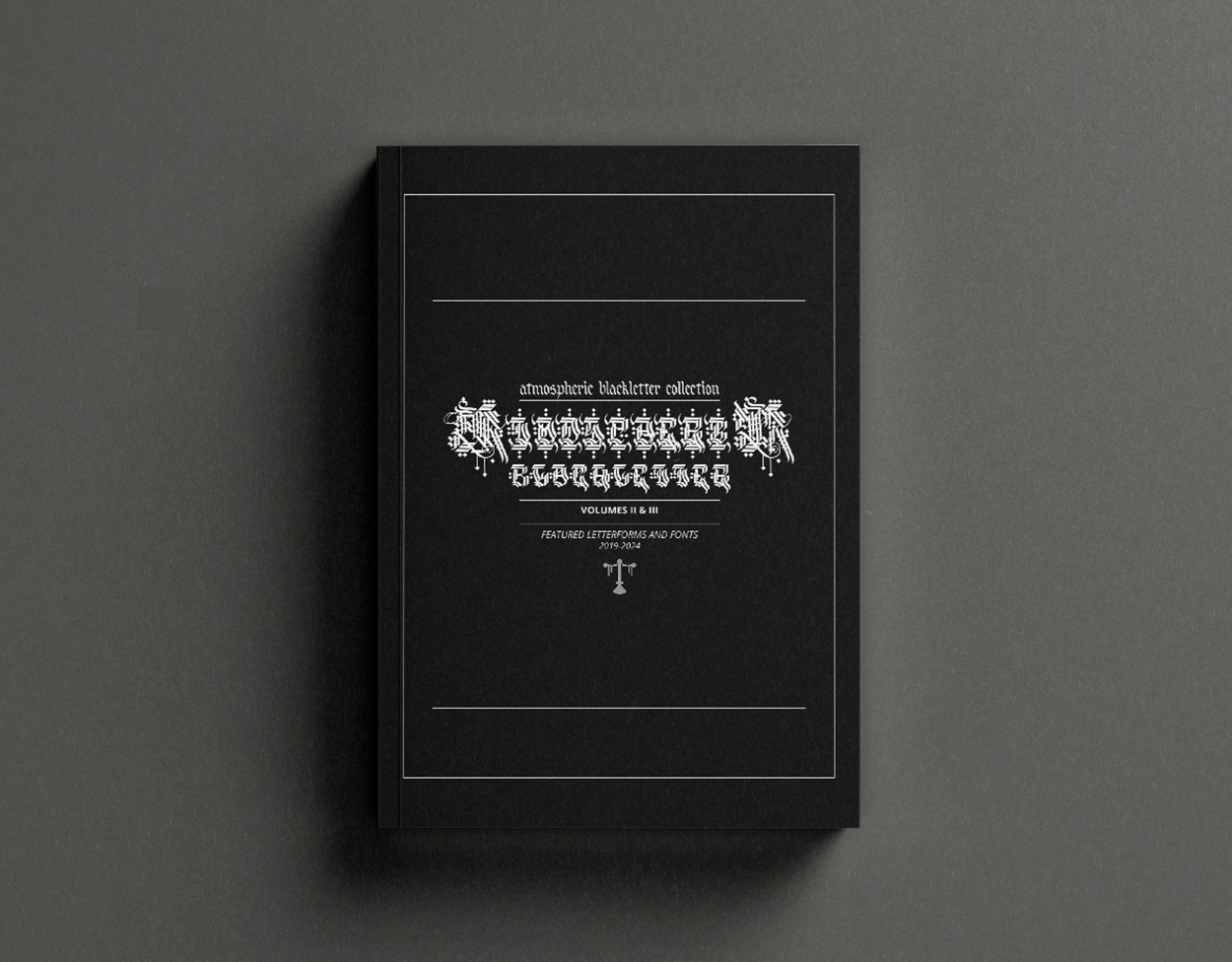
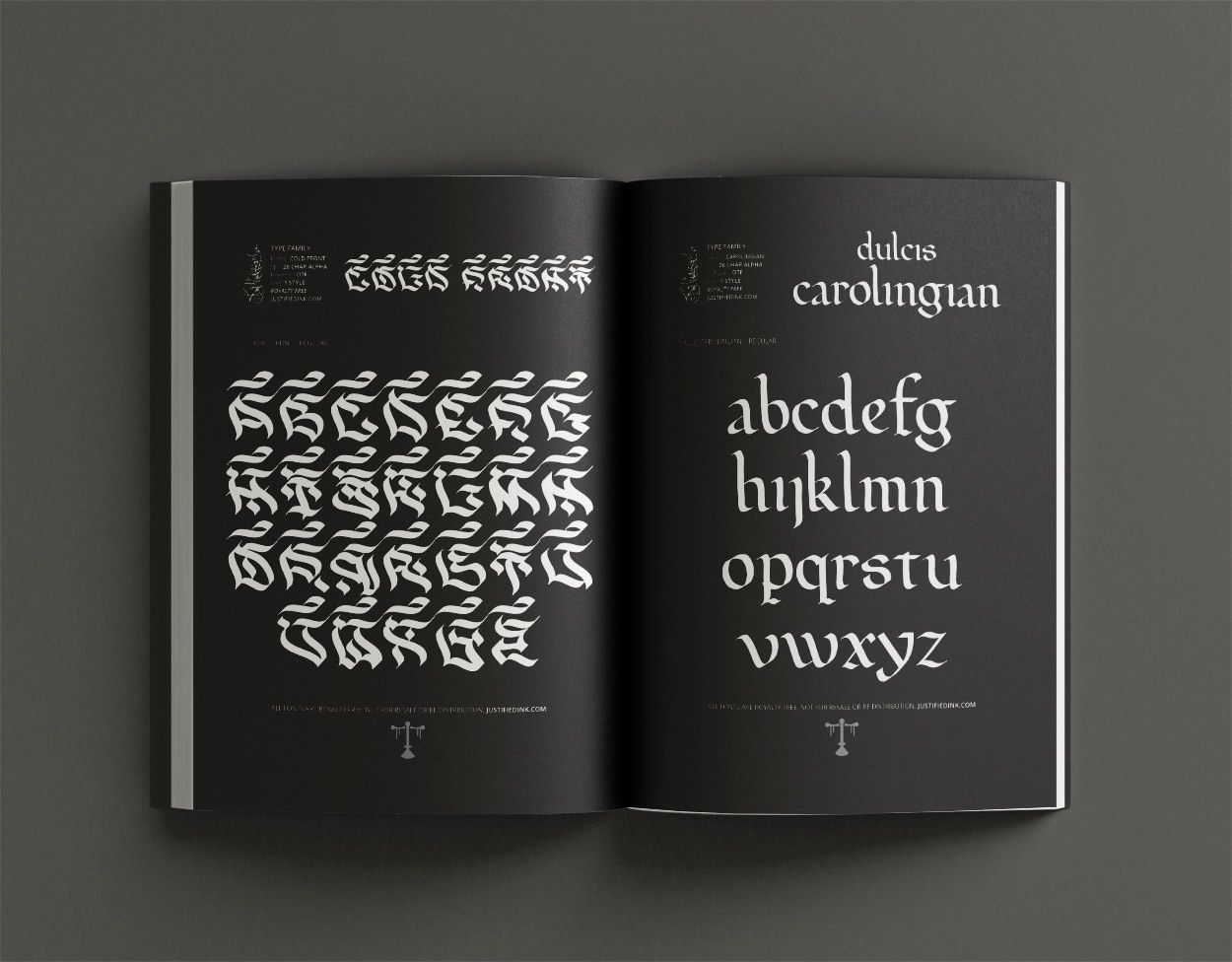
And that same arc extended further into the Atmospheric Blackletter book collection — taking digital type and shaping it into a complete, physical body of work. That step required design cohesion, layout discipline, production decisions — another expansion of the skill set.
Resilience, in my experience, isn’t about surviving a single event. It’s about adapting repeatedly as the work demands more from you.
Every time the ceiling rises, you decide whether to grow into it.
The Justified Ink Gothic font generator is proof that if you stay with something long enough — even when you’re not particularly good at it — you can eventually build something that didn’t exist before.
Is there something you think non-creatives will struggle to understand about your journey as a creative?
I don’t think you have to be a “creative” to appreciate what I do — but it helps to understand one thing:
Not everything is made for everyone.
A lot of criticism comes from proximity without alignment. People encounter work that isn’t designed for them and assume it’s flawed, when it’s simply not theirs. That shift alone changes everything. You don’t need to critique what you don’t connect with.
I’ve always known my work wouldn’t appeal to everyone. My fonts are stylized. Rooted in blackletter, graffiti, historical structures. My apparel carries specific ideas. My tools are curated from personal practice, not trend forecasts. I don’t design for mass consensus — I design for resonance.
That requires a certain resistance.
As a creative, you learn quickly that gatekeeping exists at every level. There will always be someone more experienced, more established, more technically refined. There will always be critics who misunderstand the intention, or people who simply don’t like you. If you internalize all of that, you stop moving.
So you build resistance.
Not arrogance — resistance. The ability to continue refining your work without waiting for universal approval. The clarity to say, “This is what I make,” and allow the right audience to find it.
My journey has been deeply personal. I build systems because I need them. I create tools because I use them. I design fonts because I want to see them exist. The fact that others connect with them is meaningful — but the pursuit itself would continue either way.
If there’s insight I’d offer, it’s this:
Creative work is not a vote. It’s a signal.
You put something into the world. Some people recognize themselves in it. Some don’t. Both outcomes are fine.
The only real failure is abandoning the work because it didn’t please everyone.
And that was never the goal.
Contact Info:
- Website: https://justifiedink.com/
- Instagram: https://www.instagram.com/justifiedink
- Facebook: https://www.facebook.com/justifiedinkcreative
- Linkedin: https://www.linkedin.com/company/justified-ink/
- Youtube: https://www.youtube.com/@justifiedink
- Other: https://justifiedink.com/gothic-font-generator/
https://shop.justifiedink.com/