We recently connected with Tinglung Chang and have shared our conversation below.
Tinglung, appreciate you joining us today. Going back to the beginning – how did you come up with the idea in the first place?
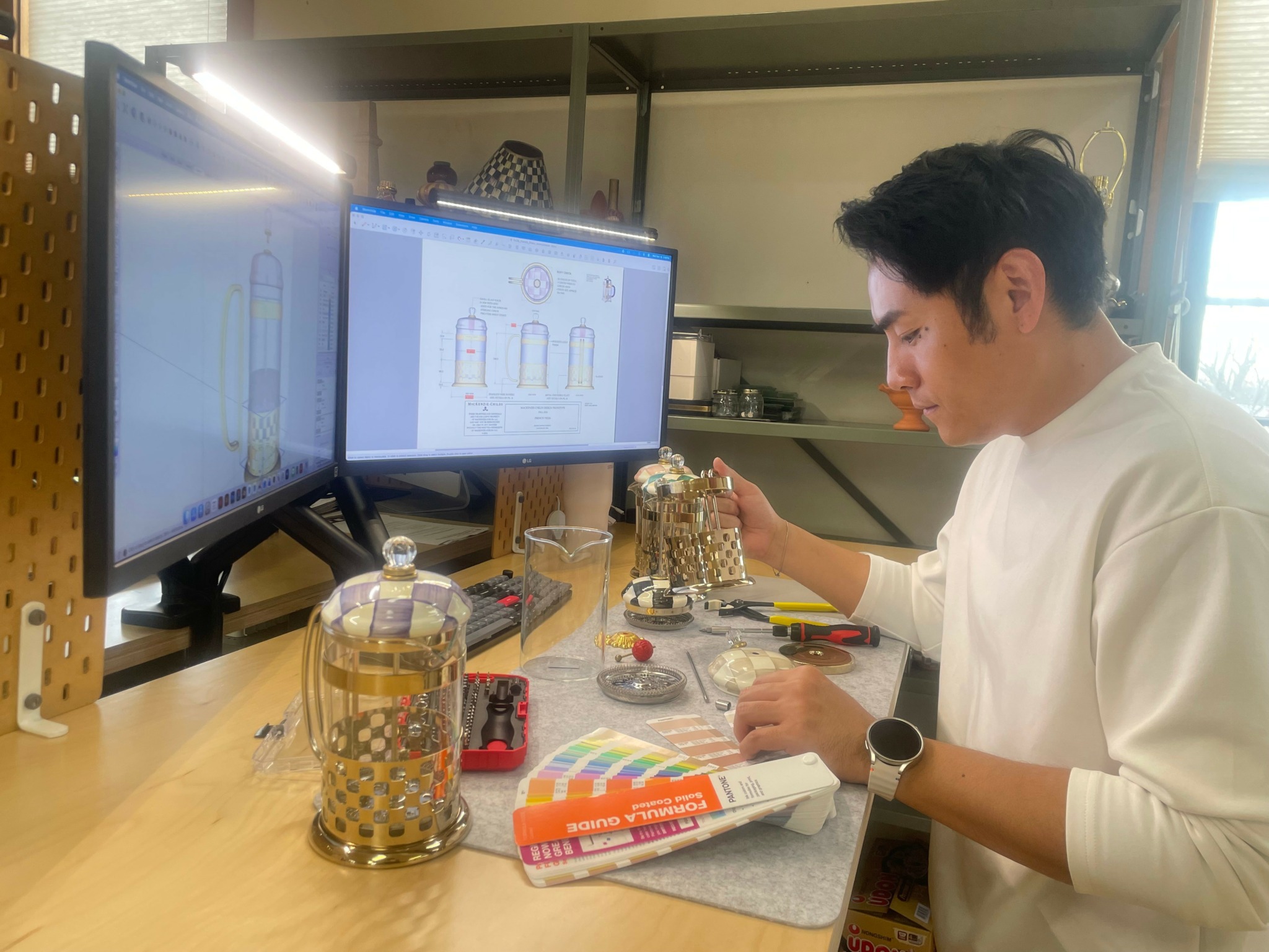
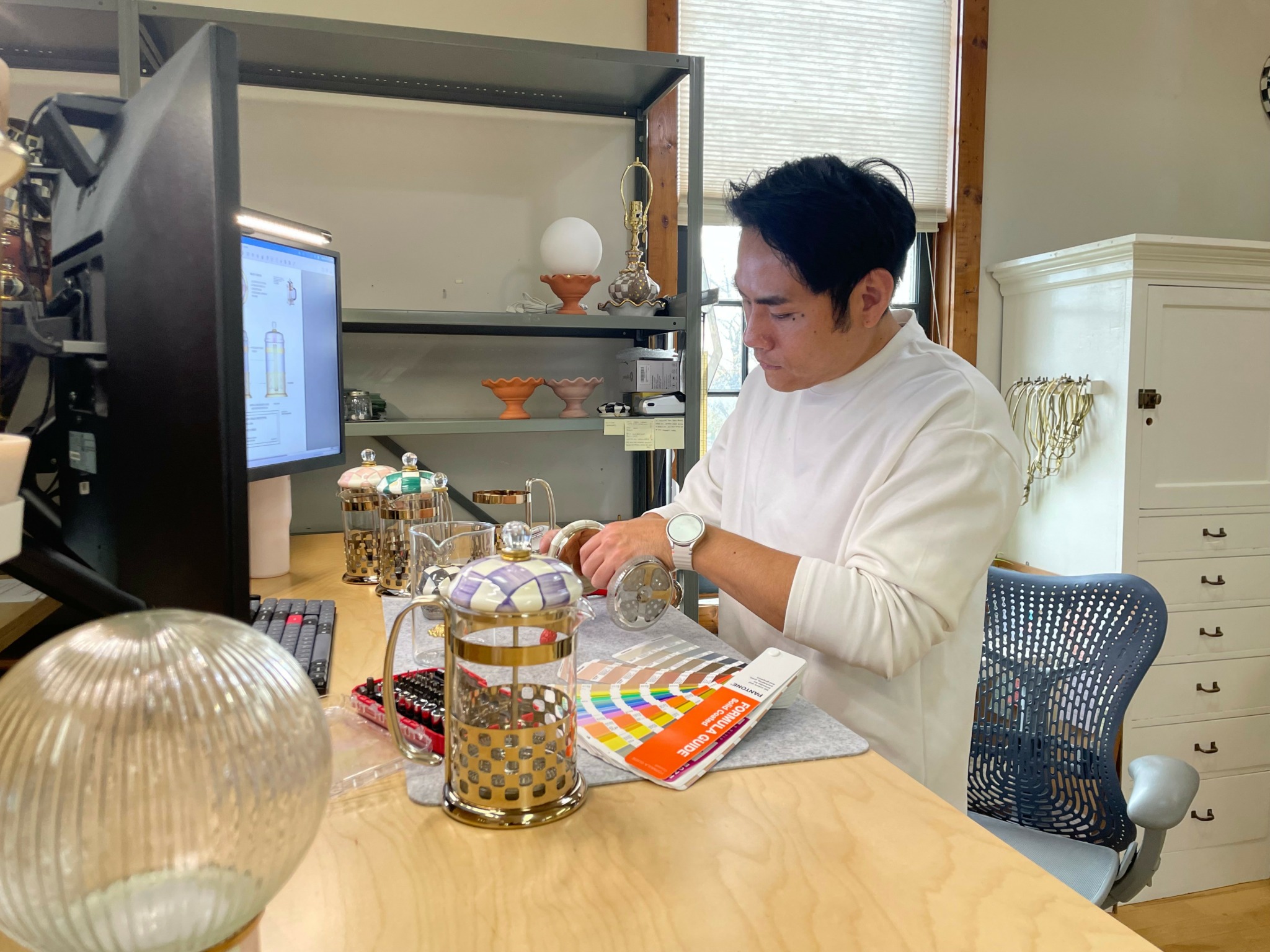
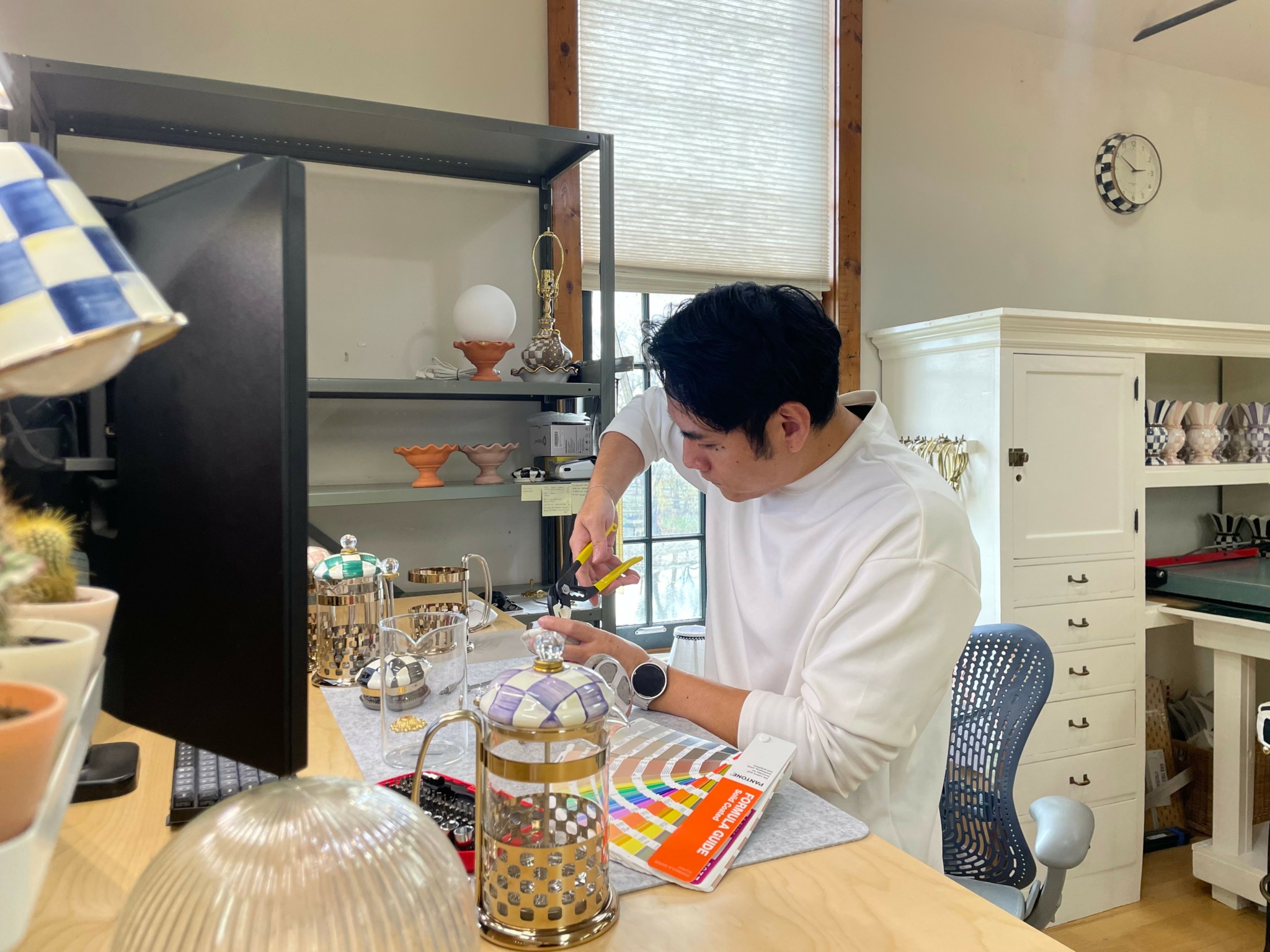
The development of this French Press began with a deep exploration of the MacKenzie Childs design language, especially the hand painted check pattern that has defined the brand for more than thirty five years. Working closely with our artisans allowed me to understand how subtle variations in brushwork, color transitions, and rhythmic repetition give the brand its unmistakable visual identity.
With this foundation, I began imagining how this expressive language could move beyond a static surface and find new life within glass and metal. Instead of treating the checks as decoration, I approached them as a structural vocabulary that could interact with light and liquid. Through sketches, material mockups, and visual trials with changing liquid levels, I developed a laser cut metal cage that allows the pattern to shift gently as the liquid rises and falls. The goal was to let the motif breathe and unfold in a contemporary expression while staying true to its handcrafted origin.
When designing the interaction between the user and the object, I focused on natural human behaviour. I observed how people lift, hold, and set down a French Press, then refined the placement of the welded joints so the cage stabilizes the glass when lifted and releases it effortlessly when placed down. This creates a more intuitive and comfortable experience without altering the familiar silhouette of the French Press.
Throughout the process, preserving the artistic soul of the brand was essential. The lid is still hand painted by artisans, stroke by stroke, allowing each piece to retain the warmth, individuality, and emotional resonance that define MacKenzie Childs.
The final design brings together cultural heritage, contemporary craft, and thoughtful human centred refinement. It reflects my approach to design as a practice that integrates storytelling, material sensitivity, and everyday usability into a coherent and meaningful whole.
This project was selected for participation in the Red Dot Young Professionals Programme, which recognizes emerging designers with promising conceptual and aesthetic direction.
Tinglung, love having you share your insights with us. Before we ask you more questions, maybe you can take a moment to introduce yourself to our readers who might have missed our earlier conversations?
I am a designer specializing in furniture, lighting, and everyday objects, currently serving as the Design Operation Manager and product designer at MacKenzie Childs in the United States. For me, an object is never just a form—it is a mediator between the body, space, and emotion. I am particularly drawn to how proportion, material, and craft work together to create a sense of presence and intimacy, allowing an object to feel natural and trustworthy the moment it is held, as if it had always been meant to be that way.
In two thousand twenty five, my work received recognition in both the Industrial Design and Interior Design categories of the MUSE Design Awards. For me, it wasn’t just an accolade—it affirmed my approach to design as a unified practice that spans furniture, lighting, tools, and spatial objects. My goal has always been to build a coherent way of thinking that moves fluidly across disciplines.
Over time, I have developed a personal design philosophy grounded in clarity, balance, efficiency, and system thinking. Good design goes beyond visual appeal or basic function—it must also streamline the processes of making, assembling, maintaining, and long term use. Whether I am working on VersaHammer or the MacKenzie Childs French Press, I am essentially doing the same thing: integrating brand language, craft, user behavior, and production logic into one cohesive and emotionally resonant system.
At MacKenzie Childs, part of my work is to design signature products such as the French Press, lighting, and decorative objects. The other part is to optimize the bridge between design and manufacturing, ensuring that the brand’s hand painted heritage can merge seamlessly with modern craft. For the company, the question is never simply “Does it look good?” but “Can this design be produced consistently, understood intuitively, and maintain its value over time?”
If I were to describe what sets my practice apart, there are three elements.
First, I place significant emphasis on the depth of brand language. For the French Press, I invested deeply in understanding thirty five years of the brand’s hand painted check tradition and translated that spirit into glass and metal, rather than merely applying a decorative pattern.
Second, I view products through a systemic lens—not only as standalone objects, but in relation to craft processes, supply chains, and daily behavior.
Third, I see craft as a form of empathy. Every proportion, curve, and weld responds to a genuine human gesture rather than serving decoration alone.
What I’m most proud of is not a single piece of work, but the moments when different disciplines—craftspeople, engineers, brand teams, and users—find alignment in one product. VersaHammer’s international recognition validated my effort to bring system thinking into tool design, while the French Press demonstrated how the same design principles can extend into tableware and everyday rituals, allowing the brand’s hand painted tradition to be experienced anew in the first cup of the day.
If future clients, readers, or followers learn about my work, I hope they understand this:
I am not designing for a moment—I am designing for a long term relationship.
I want my objects to feel “inevitable” even after years of use, as if they could not have been any other way.
That sense of clarity, trust, and embodied familiarity is what I consider my true design signature.
What do you think is the goal or mission that drives your creative journey?
The core mission behind my creative journey is not about inventing new forms, but about redefining the relationship between everyday objects, the body, materials, and the cultural language of a brand.
I have always believed that the value of an object does not come from shape alone. It emerges from the system behind it—
how a brand’s visual language is translated into form,
how materials interact with light,
how craftsmanship preserves human warmth,
and how the human hand naturally connects with the object.
This mission became particularly clear in the creation of the MacKenzie Childs French Press.
It was never about designing a coffee maker. It was about revisiting thirty five years of hand painted check patterns and asking:
If this iconic motif could move, breathe, and be experienced—not merely seen—what form should it take?
This question led me to deconstruct the brand language into light, metal, glass, and user movement, and then rebuild it in a new way:
the check pattern flows with the rise and fall of the liquid,
the curved handle isn’t just a handle but a structural lever that gently controls the cage tension,
and the artisan painted lid is not decoration but the most direct carrier of the brand’s soul.
This approach comes from a design philosophy I’ve developed over the years:
using system thinking to integrate culture, craftsmanship, and real human behavior, so that an object feels natural, credible, and quietly inevitable.
I aim to create objects that honor a brand’s heritage while responding to human intuition—
objects with poetry and structural clarity,
with beauty and long term trust,
with emotional resonance and real world logic.
That is the mission that continues to guide my work and my journey as a designer.
Are there any books, videos, essays or other resources that have significantly impacted your management and entrepreneurial thinking and philosophy?
The resources that shaped my thinking do not come from a single book or methodology, but from a cross-disciplinary way of learning. I have always seen myself as someone who builds bridges between brand, craft, and human behavior. To do that, I draw from management theory, design thinking, craft philosophy, and real user observation at the same time.
Across these domains, three categories have influenced me most:
The first is management and systems thinking, especially articles from Harvard Business Review and MIT Sloan.
I am deeply interested in how creative processes become scalable, repeatable, and structurally sound.
This directly influences my role at MacKenzie Childs:
I design objects, but I also redesign workflows, communication frameworks, and the way design interacts with craft and manufacturing.
For the French Press, I broke down thirty five years of brand language into material logic, light logic, and behavioral logic, then rebuilt them into a system that can be manufactured, hand interpreted, and experienced in daily use.
The second is human centered design approaches, including case studies from IDEO and the Stanford d.school.
They emphasize uncovering “overlooked truths” in everyday actions.
This shaped how I approached the French Press:
People do not consciously think about how to lift or hold a pot. They simply reach, grasp, lift, and release.
So I built the structure around these natural gestures, allowing the cage to tighten slightly when lifted and release smoothly when set down.
It is not an engineering gesture; it is a response to real human movement.
The third is craft and brand philosophy, including writings on Japanese craft culture and the idea that craftsmanship is a form of empathy.
These sources taught me that brand language is not a pattern but an attitude.
MacKenzie Childs checks are not iconic because they are black and white.
Their soul lies in the breath of each brushstroke, the drag of pigment, and the warmth of a human hand.
This shifted my thinking and led me to turn the French Press pattern into something that “breathes” with light and liquid, instead of a graphic applied on top.
Together, these resources shaped my method:
to integrate brand, craft, and human motion into a single coherent system, ensuring that an object does not just look good, but lives naturally within everyday life—clear, trustworthy, and built for long term companionship.
Contact Info:
- Website: https://www.stevechang.info/
- Linkedin: https://linkedin.com/in/stvchang